|
|
|||||||
|
|
|
|
|
|
|
|
|
|
|
|
|
|
|
|
|
|
|
Curse of the Trading Range 2 Adam Hamilton January 21, 2005 3625 Words
Due to the stock markets’ largely poor performance in 2004, the idea of a trading range has come back into vogue. Whenever Wall Street temporarily loses faith in its usual all-bullish-all-the-time mantra, it tends to revert back to drumming up trading-range expectations among its clients.
Trading ranges can be quite advantageous from a financial-industry perspective. When the markets are meandering in a trading range, both stock picking and timing become crucial skills. Big profits can only be won if the right stocks are traded at the right time. Trading ranges probably reward hard-won market expertise more than any other type of trending market.
Trading ranges negate the relative ease of trading secular bull markets. In a normal bull, the rising tide lifts virtually all boats. Just as in 1999, all one has to do is buy a stock, almost any stock, at almost any time and it is likely to blossom into a profitable trade along with the markets. This is why the famous dartboard stock-picking studies work so well during long-term bulls. But the value of pure luck fades considerably in a trading range.
Thus normal trading ranges can be good news for the financial industry, as the premium placed on market expertise grows considerably when one can’t just rely on luck and buy any random stock and expect a win. But what happens when the trading range becomes far larger and ominous than most investors can even imagine?
Prior to the election rally, the 2004 trading range lasted roughly ten months. The psychological implications of the markets failing to advance for less than a year are fairly trivial, investors can take a sub-year consolidation in stride. But what if a trading range lasted ten years or longer? Would it eventually cause investors to lose interest and give up on the markets?
If a decade-plus trading range sounds absurd, then you haven’t done your market homework. On February 9th, 1966 the most famous stock index on the planet, the mighty Dow Jones Industrial Average (Dow 30) closed just above 995, tantalizingly close to the fabled 1000 mark. But how long after that did it take the Dow to actually close above 1000 for the first time ever? A whopping six-and-a-half years when it hit 1003 on November 14th, 1972.
But wait, it gets worse. After less than 50 trading days trying to establish a toehold above 1000, by January 1973 the Dow started faltering again. It briefly challenged 1000 again in 1976 and 1981, but failed to break decisively above both times. It wasn’t until October 11th, 1982 when the mighty index finally launched its final assault to leave 1000 in the dust for good.
The elite Dow 30, the bluest of the blue chips on the planet, traded in an excruciating trading range for no less than sixteen-and-a-half years from early 1966 to late 1982! As you can imagine, the psychological fallout among investors in a market not advancing over 17 long years is staggering. In fact, in 1982, financial magazines and newspapers were heralding the “death of stocks”. Sentiment was horrifically negative, perhaps even challenging the early 1930s.
I believe a decade-plus trading range is a curse for investors, the worst possible environment for the markets. Yet, it is one of the two key ways overvalued markets work their way back down to undervalued levels. They can either mercifully crash fast and get all the carnage out of the way in a few years as in the early 1930s, or they can brutally consolidate over more than a decade as in the 1970s and grind long-term investors into dust.
Unfortunately the evidence is mounting today that we may be in another massive decade-plus trading range in the US markets. I started seriously considering this ominous possibility about three years ago when I wrote the original “Curse of the Dow Trading Range” essay. Revisiting my earlier research, I am saddened to have to report that this nightmare scenario indeed appears to be playing out.
This long trading range thesis is based on the tendency of the stock markets to move in great valuation cycles running about a third of a century each. Stocks start undervalued, are gradually bid up to overvalued levels, and then they slump back down to undervalued levels yet again and the cycle begins anew. I call these great cycles Long Valuation Waves. Their wavelength from trough to trough runs roughly 33 years.
In 1966, for example, stock valuations reached a multi-decade high. The next valuation high was not achieved until early 2000, a third of a century later. In 1949, stock valuations reached a multi-decade low. The next valuation low was not witnessed until 1982, also exactly one-third of a century later. While Wall Street will deny this market truth to its dying breath since it won’t help sell stocks to a perpetually gullible public, the historical evidence is unassailable.
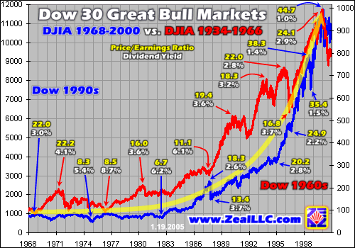
If you graph these Long Valuation Waves, they look like parabolas. Our first chart updated from my original essay shows the last two-thirds of the twentieth century cut into individual thirds and superimposed over the top of each other. Each third shows an entire valuation wave from peak to trough to peak.
Other than the order-of-magnitude-different Dow 30 scales, the similarities between the two ascent arcs in the up-phases of the last two Long Valuation Waves are remarkable. While the X-axis only lists the years for our latest valuation wave from the late 1960s to 2000, the annual hash marks also correspond to the previous valuation wave from the 1930s to the late 1960s. Both vertical axes are zeroed so the respective percentage gains are perfectly comparable without visual distortion.
While the visual comparison of actual Dow 30 index readings from the last two valuation waves is stunning and dramatically parabolic, the actual engine driving the valuation waves is only apparent in the underlying valuation readings. At various key technical points above we labeled the prevailing US stock market P/E ratio and dividend yield at the time to communicate the valuation dynamics under the surface of the index moves.
Before we delve into valuation waves though, a reference point is crucial. The century-long average P/E ratio for the US markets is about 14x earnings, so valuations near 14x are considered fair value. In general terms stock markets are considered undervalued when trading at less than 14x earnings and overvalued when trading at greater than 14x earnings.
Dividend yields, the other key valuation metric, work similarly but in the opposite direction. The century-long average dividend yield of the US markets is around 4.6% or so. In general terms stock markets are considered undervalued when they yield more than 4.6% and overvalued when they yield less. If you keep 14x earnings and 4.6% yields in your mind as the fair-value midpoint, it becomes much easier to digest this analysis.
In both valuation waves rendered above, the Dow 30 started higher from very undervalued levels. In 1982 for example, the same year mentioned above when mainstream financial magazines and newspapers declared that stocks were dead, the US markets traded around 6.7x earnings and yielded 6.2%. It is at these very dismal valuation lows, when sentiment is horrific and stocks are cheap, that prudent long-term contrarian investors strive to throw long in a big way.
As late as 1949 in the previous valuation wave, the markets were trading at 9.1x earnings and yielding 6.3% in dividends, also chronically undervalued levels. Believe me, it is absolutely no coincidence that the two greatest bull markets in stocks in the past two-thirds of a century both launched from terribly undervalued levels. Buying cheap is as important for long-term investing as it is for short-term speculating!
From 1982 to 2000, and 1949 to 1966, investors gradually became interested in stocks again and bid up not only their prices, but their valuations. Valuations relentlessly climbed in both super bulls for about 17 years, which is not coincidentally one-half of a typical one-third-of-a-century Long Valuation Wave. As you can see on the chart above, PE ratios for the general markets gradually rose during these two 17-year periods while dividend yields gradually contracted. The markets were inexorably becoming overvalued.
Both valuations and index prices were rising in a parabolic pattern. Parabolas are neat creatures, appearing all over the place in the markets. Parabolic patterns start out gradually rising, but with each passing year their percentage gains increase until they eventually become unsustainable. Parabolas are never sustainable in the long run because the capital ultimately required to feed vertical growth rates quickly becomes absurd.
In 1999, for example, the Dow 30 gained a breathtaking 25% in a single year. This compares to a long-term average somewhere around 7%. I’m sure you remember all the New Era nonsense of 1999, when the general public started believing 25% gains were now normal and could be expected in the future. Yet the very mathematical nature of parabolas crushes such naïve flights of fancy with all the subtlety of a sledgehammer to the skull.
To illustrate the absurdity of sustained parabolic price gains, imagine if the Dow entered 2000 at exactly 10k on the index. If we extrapolate two decades of normal 7% annual gains, the Dow could have reached 38,700 by 2020. This is certainly possible. But if we instead extrapolate two decades of stellar 25% gains, the final result becomes ridiculous. Starting at the same 10k base, it would yield a Dow 30 trading at an index level of 867,000 by 2020. I doubt all the capital on the planet could push the Dow 30 that high in anything less than a century!
As the Long Valuation Wave peaks near, such as in 1966 and 2000, index levels and valuations have simply been bid up as far as they can go. When the apex of a valuation wave finally rolls in every third of a century, there is not enough new capital available to flow into the markets and sustain the parabolic rise in valuations and prices. At that point the valuation waves head back out into the seas of time and valuations and prices start falling.
Acknowledging the third-of-a-century flow of the valuation waves is crucial if you want to understand the growing danger of the curse of the long trading range. In the chart above, the remarkable similarities in the previous two mega bulls are stunning. If the ascent phases of the last two valuation waves are this congruent, isn’t it reasonable to ask the question of whether the descent phases will be similar as well?
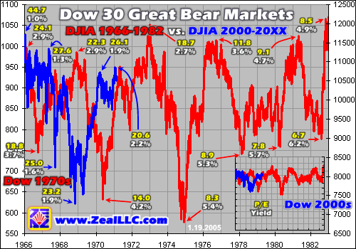
If this indeed proves to be the case, then the long trading range we saw from the previous valuation wave peak in 1966 to the last valuation wave trough in 1982 could be what we are now facing again from our latest valuation wave peak in 2000 to the next valuation wave trough somewhere out in the future. Ominously, the Dow 30 behavior in the past five years since the valuation peak is already behaving like a long trading range.
Our second chart this week highlights this troubling congruency. The last long trading range from 1966 to 1982 is rendered in red on the left axis and labeled on the X axis. Our current Dow 30 performance from 2000 until today is superimposed and slaved to the right axis. While there are no current Dow dates on the X axis, the one-year hash marks correspond to today as well.
Lest anyone suggest we cunningly modified our vertical axes to force this relationship, the small inset chart in the lower right shows the exact same picture as the big chart with true zeroed axes for a perfectly undistorted absolute visual reference. The implications of this analysis are so dire that investors have to understand that there is nothing contrived here. What you see on this chart is what is really happening, so God help the long-term stock investors who fail to recognize the curse of the trading range in time.
Recall that Long Valuation Waves generally run one-third of a century or so each. Our opening chart above showed the fun ascent phase, the first half. This second chart highlights the not-so-fun descent phase, the second half. During the descent phase valuations gradually migrate from overvalued to undervalued and the actual stock markets meander helplessly in a colossal trading range running for up to 17 years without respite.
Following the Dow 30’s dazzling February 1966 top just shy of the fabled 1000 level, the index spent the next 17 years in a grinding trading range. The range’s extremes ran as high as 1052 in January 1973 to 578 in December 1974, a massive range of 45% from its 17-year high to its 17-year low. If you carefully examine the chart, you will also note that this 1970s trading range consisted of sharp bull years and sharp bear years, temporary cyclical trends running for a couple years within the primary secular trading range.
If we compare the Dow 30’s recent performance since its early 2000 top, the sense of déjà vu imparted with the last long trading range is uncanny. In January 2000, exactly five years ago, the Dow reached its latest all-time closing high of 11723. In October 2002, it briefly closed at 7286 in a particularly vicious V-bounce. Peak to trough, so far this is a 38% trading range from its 5-year high to its 5-year low.
The Dow’s latest 38% range is uncomfortably close to the 45% range the index witnessed in the 1970s. Interestingly, if we limit our 1970s comparison to only the first five years of the last long trading range for a better match, the results are even closer. From the February 1966 high of 995 to the first major low of 669 in July 1970 the initial 5-year range was 33% back in the late 1960s. So we are already seeing more macro volatility today than last time even! Technically you have to admit that the similarities between the past 5 years of Dow action and the first 5 years of the last long trading range are incredible.
Visually the comparison is rather stunning too. Though the peaks and troughs are currently out of phase by a couple years or so, the general technical nature of the two long trading ranges is nearly identical. In both cases we witnessed periodic sharp cyclical bear declines over a year or two followed by equally sharp cyclical bull rallies over a similar period of time. The net chart effect is a massive long-lived trading range beyond the wildest expectations of most investors today.
While the intriguing technical comparisons observe an effect, the more important underlying cause is the great valuation mean reversion of the second half of the Long Valuation Waves. Like winter inevitably follows summer, the mean reversion from highly overvalued markets by historical standards to undervalued markets is also inevitable and unstoppable. Not even governments with all their sound and fury are able to prematurely end the unpleasant second half of the valuation waves.
This ongoing process is easiest to see if you read the valuations off the periodic interim tops of the long trading ranges. From 1966 to 1982 for example, the general stock market valuations went from 24.1x, to 22.3x, to 18.7x before they hit fair value around 14x in the brutal 1973-1974 cyclical bear. But they didn’t merely stop at 14x fair value! The next three peaks were 11.8x, 9.1x, and 8.5x earnings. Dividend yields climbed from 2.9% to 4.9% across the market peaks in this same period.
Valuation mean reversions don’t just run from overvalued to fair value, but from overvalued all the way down to undervalued. Like a giant pendulum swinging through a third of century, upside valuation extremes are followed by equally stunning downside extremes. The valuation pendulum doesn’t just magically stop in the middle of its arc at 14x earnings once its great swings start.
Our latest Dow peaks since 2000 have told an identical valuation mean reversion tale. Starting at a staggering 44.7x earnings at its all-time high, the Dow has dropped to 27.6x earnings in its 2001 peak, 26.1x in early 2004, and 20.6x today. This valuation trend already in force, running from far overvalued to pretty overvalued so far, has a highly probable future course of plunging through fair value of 14x earnings to an ultimate undervalued low between 7x and 10x sometime in the next 10 to 12 years.
Our current Dow 30’s dividend yield is also mean reverting back up, from 1.0% to 1.3% to 1.9% to 2.2% today. It ought to get over 6% before the next long-term secular valuation bottom similar to 1982 is reached in the future. Thus not only is the Dow 30’s technical character looking like the 1970s long trading range, but its underlying valuation character looks like the same thing is happening again as well.
The curse of the trading range is multi-pronged. If investors are faced with another 12 years (17 total) of largely sideways US stock action, what vast psychological havoc will this wreak? If an average investor starts investing in his mid-20s and retires at 65 to start cannibalizing investments to live, this leaves only 40 years to multiply wealth. If the markets move sideways for almost half of an average “investing lifespan”, the damage done to a generation of investors could be catastrophic.
After the markets grind sideways for enough years, investors will gradually get discouraged or bored and leave the markets. Sentiment will grow darker and darker as valuations eventually reach undervalued levels. The vast promise of the markets in the late 1990s will be forgotten, and stocks will lose their luster compared to other asset classes. The curse of the trading range is the worst possible development for today’s stock investors.
The implications of this troubling analysis are profound for both investors and speculators.
If you are an investor, do not even think about buying stocks for the long term unless we are at one of the periodic brutal V-bounces following a year or two of a cyclical bear market. The only way to “buy cheap” in a long trading range is to patiently wait until the markets are near the bottom of their range rather than the top. An investor who went long in early 1966 had to wait 17 years to earn a penny, but a prudent investor who waited until the July 1970 V-bounce had a shot at dazzling 57% gains in only about two-and-a-half years. Timing is everything even for investing!
While luck will take any investor far in a secular bull, in a long trading range only the investors willing to take the considerable time to study the markets as a whole for timing and carefully pick individual stocks will thrive. On the bright side, if your capital survives the long trading range you will be blessed with the greatest long-term buying opportunity in a third of a century, since 1982, once the ultimate valuation bottom is reached.
For speculators, throw long at the same V-bounces investors seek and consider throwing short near the top of the long trading range. Today, for example, the Dow 30 is definitely in the upper end of its likely trading range so the probabilities of a successful short over the next year or two seem much higher than a profitable long play. Expect sharp cyclical bull and bear markets to meander within the long trading range, running for one to three years in duration each.
The bottom line is the curse of the trading range, if today’s markets follow the last valuation wave mean reversion’s ugly precedent, is one of the most challenging and dangerous environments imaginable for long-term investors. If you don’t strive to time the major cyclical runs and carefully handpick the very best stocks, you could either lose money or not earn any significant profits for 12 more years.
Like all investors I am not thrilled with this prospect, but nevertheless I am determined to play this evolving long trading range properly. Each month we painstakingly compute and track the current major stock index valuation numbers and publish them in our acclaimed Zeal Intelligence newsletter. We also have exclusive subscriber-only valuation charts updated on our website so you can track the critical mean reversion in progress yourself.
As my partners and I navigate these treacherous waters with our own capital, we will continuously research the grand market timing and individual stocks to uncover stellar trading opportunities for our subscribers.
Unlike Wall Street that is always forecasting endless gains, we tell it like it is and don’t pull punches. Believe me, I would much rather be saying that today is like 1982 and a massive 17-year bull market is coming. But the sad truth is today looks much more like 1971 with another decade of grinding sideways markets at best. Regardless of whether we like them or not, like the tragic Asian tsunami the long valuation waves will march right on through oblivious to protest and pain.
If the continuation of the valuation mean reversion already in progress is inevitable, why fight it or stick your head in the sand? A far more prudent course of action is to adapt to the sub-optimal situation at hand and thrive. Diligently study the markets, carefully pick your stocks, but don’t pull the trigger until the trading-range timing looks ideal. Or join us today in trading alternative secular bulls like commodities that are soaring while general stocks grind nowhere.
While the curse of the trading range will inflict untold misery among the unprepared, investors and speculators who understand the times and act accordingly can still thrive. Will you ultimately be counted among the former group or latter?
Adam Hamilton, CPA January 21, 2005 Subscribe |
|||||||
|
|
|
|
|
|
|
|
|
|
|
|
|
|
|
|||