|
|
|||||||
|
|
|
|
|
|
|
|
|
|
|
|
|
|
|
|
|
|
|
Trading HUI Parabolas Adam Hamilton October 15, 2004 3174 Words
One of the first cognitive skills babies learn is to identify certain shapes, like circles, squares, and triangles. It is kind of funny, but technically-oriented traders follow in these very infant footsteps when we examine charts. A big part of technical analysis involves identifying certain recurring shapes on price charts.
While I have pretty much outgrown circles, squares, and triangles, one shape that endlessly fascinates me today is the mighty parabola. My 4” thick Webster’s dictionary has a complicated definition for a parabola that only a mathematician would love, but I like to think of them as just plain old constantly accelerating slopes.
The proper definition of a slope is equally convoluted unless you have a doctorate in applied math, but the no-nonsense carpenters’ definition is easy to understand, rise over run. If you are laying piping or installing a roof, the slope is critical. A roof that rises one vertical foot for every ten feet of its horizontal distance has a slope of 1/10, a rise of one over a run of ten.
Parabolas, or constantly accelerating slopes, are ubiquitous in the financial markets. Once you start looking for them they start to pop up everywhere, kind of like Elvis sightings.
The most famous example I am aware of today is the enormous NASDAQ bubble of the late 1990s. If you examine a graph of the entire decade, you will note that the NASDAQ was barely climbing in the early 1990s, it started accelerating in the mid-1990s, and by the late 1990s it was shooting vertical in a mania frenzy. The NASDAQ carved a massive parabola! Gold left a similar parabolic slipstream in its own wake during its gargantuan 1970s bull.
These parabolas are so fascinating because they are always unsustainable in financial markets. A price can rise gradually in the early years of a major move for quite a long time, but when the really big moves erupt in the final mania years the parabola has already sown the seeds for its own destruction. Once a parabola goes vertical it becomes a kind of mathematical black hole, its own weight guaranteed to implode it back in on itself.
If you imagine a decade-long financial parabolic pattern, the final year may have a 50%+ gain. Well, if you extrapolate this vertical rise out, the resulting numbers are just plain silly. After 5 more years, this market would be 7.6 times higher. After 10 more years at +50% per year, the market would be 57.7 times higher! Obviously this is just absurd because far before these numbers are reached all the capital on earth would have been exhausted.
Thus parabolas, when they hit their final vertical zone, are absolutely guaranteed to fail in the near future. Any other outcome is mathematically impossible. As investors and speculators we have to remain aware of this macro view on parabolas. If we have a decade-long chart that is accelerating vertically with huge annual gains, then we are witnessing a mania and need to sell before the inevitable reckoning, usually a crash, arrives.
Parabolas are certainly not limited to strategic charts though. Like the markets themselves, parabolas are totally fractal in nature. A fractal is an identical shape or pattern that appears at all different scales. The whole art of technical analysis relies on this fractal nature of price charts. Just as you can draw support and resistance lines on any scale of chart from a few hours to a few decades, parabolas too can be big or small but certainly present at any scale.
I have been pondering parabolas and fractals of late as I analyze price charts. I have been wondering if parabolic shapes offer important trading clues of when a market has become overbought or oversold in an intermediate timeframe. When a parabolic formation, either bullish or bearish, goes vertical, do the probabilities swing in our favor for making trades in the opposite direction?
In order to analyze this thesis, we are going to take a look at parabolas in the HUI this week. The HUI is the premier unhedged gold-and-silver stock index, and probably the best performing sector on the planet over the last several years. The HUI is up a massive 614% bull to date from its November 2000 lows to its latest interim top in December 2003. Our subscribers, my partners, and I have been blessed with enormous realized profits trading this largely overlooked bull market.
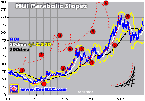
Our first graph outlines the HUI’s bull market to date and reveals large parabolas, both bullish and bearish, jumping out all over the place in the raw HUI price data.
Before we delve into the HUI parabolas, please check out the reference parabola in the lower right corner of this chart. The dotted red line, of course, is the parabola, with its constantly accelerating upslope. But the black lines that frame it are revealing. While they look like a curve, they are actually six perfectly straight black lines drawn at sequentially increasing slopes.
Thus one price, increasing its slope a half-dozen times or so over a major upleg or downleg, will create a nice approximation of a true curved parabola. This illustration is important because it helps show that a very parabolic shape can form in a price chart with only a relatively few changes in slope over the life of an intermediate trend. I call this approximation a linear parabola and recently used it in analyzing a vicious silver correction earlier this year.
The HUI’s bull market to date has formed at least six major parabolas, all labeled above. We rendered two identical sets of parabolas in this chart, one directly superimposed on the blue HUI price data with a second matching copy pasted in a little higher. While these two sets of parabolas are the same, it is useful to view them both superimposed over the HUI to see how well it conforms to them as well as independently from the HUI so we can get a better sense of the index’s true underlying parabolic nature.
Parabolas are multiplying like rabbits in this chart, but what is the whole point of this exercise? I suspect that if we can recognize the terminal vertical stage of each intermediate-term parabola in time, it can help us determine when the HUI has a high probability of rising or falling. We can then buy or sell accordingly based on whether a bullish or bearish parabola is reaching its unsustainable vertical stage and therefore hinting that an intermediate trend change is imminent.
A bullish parabola is one that is carved in a rising market, a HUI upleg. Parabolas 1, 2, 4, and 5 above are all of the bullish variety. Now if you look carefully at the lower set of parabolas actually superimposed directly on top of the HUI, an interesting phenomenon jumps out as these bullish parabolas go vertical. In all four bull-to-date examples, the HUI entered a correction without fail soon after the time the bullish parabolas shot vertical and hence became mathematically unsustainable.
It is interesting that this observation has a fractal bent too. Whether a bullish parabola lasted a long time like last year’s massive number 5 or a short time like the number 1 that kicked off this bull market, once the HUI started shooting vertical a normal healthy pullback loomed. Vertical price movements, even over the intermediate term, just cannot be sustained. When an intermediate bullish parabola is shooting vertical, it is probably prudent for us speculators to sell HUI longs, throw short, buy puts, or at the very least ratchet up our trailing stops.
During corrections following these vertical-stage bullish parabolas, inverted bearish parabolas form. Parabolas 3 and 6 above are perfect examples. In both cases the HUI reached a new bull-to-date interim high before correcting. These corrections, however, tend to start out slowly. Once a new high has been reached people are very hesitant to be anything but euphoric so early-stage corrections often witness relatively modest declines.
As the correction picks up steam though, its downslope accelerates. As the latest interim highs fade in the distance and folks grow more nervous, selling intensifies considerably. The price decay curve tends to ride an inverted parabola, falling with a constantly accelerating downslope. Eventually people get downright scared and the price drops vertically, the final stage of a bearish parabola. But just as normal parabolas are not sustainable once they shoot vertical, neither are inverted ones.
When these bearish parabolas fall vertical, odds are the correction just witnessed is pretty much over. When investors and speculators recognize these inverted parabolas reaching their vertical maturity stage, they can add new long PM stock positions, close out any shorts, or buy call options. Probabilities definitely favor the HUI launching a new bullish upleg once an inverted bearish parabola shoots vertical in a correction, and the sharp decline this past April is a perfect example.
Since the markets are ultimately just a study in probabilities anyway, it makes sense to watch for these intermediate-term parabolas. They are not precise trading signals by any means, but they seem to do a fairly good job in signaling the general season, whether a major upleg or downleg is getting long in the tooth and hence bets in the opposite direction may be profitable in the months ahead.
The HUI parabolas help us understand when the probabilities for a major intermediate trend change are ballooning, all because parabolic ascents and descents become inherently unstable and unsustainable in their terminal vertical stages.
This idea is pretty simple, but I have been struggling with how to measure it. As an active speculator, I want to trade on hard empirical data that I can quantify and compare, not just the subjective “I have a feeling this is getting too vertical here”. I suspect the HUI parabolas would become the most useful, not to mention the most emotionally neutral, if there was some way to precisely measure them.
After weeks of thinking about this problem, I am disappointed to admit that I haven’t found an elegant solution. One of the reasons I am writing this essay is to solicit feedback for superior ideas to measure these unfolding parabolas. So if you have a better idea than this admittedly sorely lacking one I am going to present, please drop me an e-mail. If you solve this parabola measurement puzzle I would be honored to discuss the solution in a future essay, thanking you by name and granting you all the glory.
Parabolas are constantly accelerating slopes, and a slope is a rise over run. While not satisfied with this interim idea, the best I have been able to muster is measuring HUI parabolic slopes as percentage gains over time. Unlike building a roof where both the rise and run are in feet, in charts the rise is in price and the run is over time. Time and price are not synonymous so this isn’t really a pure slope comparison.
After playing with all kinds of different timing mechanisms to measure the X-axis of time, the one that struck me as the most interesting was a 15-trading-day percentage change in the HUI close as an approximation of slope. 15 days is three trading weeks, which seems to feel about right given how long interim topping and bottoming processes at the apexes of parabolas typically take to unfold. If a parabola can shoot vertical to a big gain or loss over three trading weeks, then perhaps it is vertical enough to anticipate a trend change.
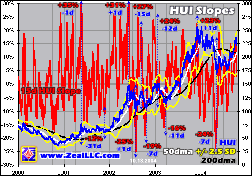
Our final graph attempts to quantify this initial attempt to measure parabolic slopes. The HUI slides over to the right axis, and the 15-day percentage change in the HUI is graphed on the left axis in red. While the raw red squiggly line looks like the electrocardiogram of Alan Greenspan the day gold crosses $1000, it actually hides some provocative data. While this can’t be the ideal slope measurement, it still illustrates the general validity of this parabola trading principle.
Since this graph is busy even by my loose standards of busy-ness, we didn’t draw in the parabolas again. But once you see them as we did in the first graph, it is really hard to miss them. Kind of like those computer-generated pictures hidden in white and black dots that look like random visual noise at first, once you finally see the image hidden within the first time you can’t help but focus on it instantly when you look again.
The key to understanding this chart is the blue HUI line. We took the greatest trading opportunities in this entire HUI bull market to date, including all the interim highs and lows signaled by the parabolas above, and we drew vertical blue lines through them. In hindsight these were the best moments to trade, both long and short, to maximize profits during the HUI’s bull market.
Each vertical blue line marking great moments of opportunity for HUI trades intersects the violent red 15d percentage change line. These intercepts reveal where this 15d approximation of the HUI’s slope was meandering at each opportune moment to trade the index.
Per the parabola theory, the 15d slopes of the HUI should be extremely high near major interim tops and extremely low near major interim bottoms, marking the final vertical stage of major parabolas. This indeed proved to be the case as the graph above reveals. This HUI slope chart is easiest to interpret if we start our analysis at major interim highs in the HUI.
The five red percentage numbers on top of this chart show where the HUI 15d percentage change slope approximation happened to be at or near major interim highs in the HUI. The blue numbers underneath these percentage changes show the offset, in days, between the 15d HUI slope top and the actual interim top in the HUI itself. A -1d number indicates that the 15d HUI slope topped one day before the HUI itself, while a +1d indicates the slope topped one day after the HUI.
It is interesting that every major HUI interim top happened when the 15d slope of the HUI was extremely high, running from a 23% gain over the past 15 trading days alone on the low side to a massive 35% on the high side. Can you imagine the HUI blasting up 35% higher in only 15 trading days? Wow! The average 15d HUI slope at these major tops was 28%, very high. Thus if we see a situation in the future where the HUI has advanced by 25%ish or more in only three weeks, odds are its current parabola is shooting vertical and is hence unsustainable so a healthy correction is due.
The offsets between 15d HUI slope tops and the actual HUI tops are revealing as well. First, note that the three biggest HUI uplegs to date, parabolas 1, 2, and 5 from the first graph, all ended with fresh new bull-to-date highs, slopes nearing vertical, and trivial offsets of only plus or minus a single trading day. So it looks like the maximum 15d HUI slopes do indeed occur very close to major new bull-to-date highs signaling the end of each major upleg.
But if we get stuck in a largely sideways trading range where the uplegs and corrections are fairly minor, like in late 2002 and early 2003, then the offsets balloon quite a bit. Thus the parabolas, or at least this imperfect 15d approximation of the HUI’s slope, are not as useful in a sideways grinding market between major uplegs and downlegs.
Shifting our attention to the major interim lows in the HUI, the 15d HUI slope numbers and offsets are still useful but less precise. Of the five greatest buying opportunities in the HUI since its bull launched, the average 15d HUI slope during these times weighs in at -19%, but the range is pretty broad running from -12% to -25%. In light of this data, if the HUI is correcting and an inverted bearish parabola is forming, once the HUI trades down 15%+ in only three weeks odds are that a major new upleg is imminent.
The offsets are all over the map at these major interim lows in the HUI, with its 15d slope tending to bottom anywhere from six weeks to one week before the HUI itself. On the bright side, I looked through all of these offsets individually, both on the high and low side, and found that generally even buying or selling as appropriate at the 15d HUI slope high or low would have been very profitable. Usually the difference between the HUI on the 15d slope extreme day and the actual interim extreme day in the index itself was trivial, within a few percent or so.
While this particular approximation of the HUI parabolas is certainly not precise enough to define a hard and fast trading tool, it does still seem useful for helping us understand when probabilities swing in our favor for major uplegs or corrections.
If the HUI is in an upleg shaped like a parabola, that is accelerating higher, and the index has rocketed up 25% or more in only three trading weeks, then odds are that particular upleg is waxing too euphoric and a correction is imminent. In these situations, if other trading indicators concur, speculators can liquidate HUI longs, throw short, buy HUI puts, or at the very least ratchet up their trailing stops in anticipation of weakness.
Conversely if the HUI is languishing in a correction shaped like an inverted parabola, that is accelerating lower, and the index has plummeted by 15% or more in only 15 trading days, then odds are that particular correction is growing too fear-laden and an upleg is imminent. During these exciting times like this past May, if other trading indicators concur, investors can buy PM stocks while speculators can buy stocks, close shorts, or buy HUI calls.
If you are interested in trading these major uplegs and corrections in the HUI, which have been very profitable bull to date, please consider subscribing to our acclaimed monthly Zeal Intelligence newsletter. We have been painstakingly analyzing and actively trading this entire 614% HUI bull to date and have been blessed with some awesome realized gains in past uplegs and unrealized gains in this current upleg. We will continue to refine our analysis and tools and alert you to potentially stellar HUI-related trading opportunities going forward.
The bottom line is intermediate parabolas formed on price charts have great potential for helping speculators define probabilities weighing whether an intermediate trend change is imminent. When you see any multi-month trend accelerating vertically to the upside or downside, chances are this move is unsustainable and the inevitable reversal is looming.
While I don’t particularly like this clumsy 15d HUI slope approximation described here, I am confident that there is some elegant way to measure these parabolas empirically and perhaps even distill these measurements into a promising trading tool. Please let me know if you figure it out!
Adam Hamilton, CPA October 15, 2004 Subscribe |
|||||||
|
|
|
|
|
|
|
|
|
|
|
|
|
|
|
|||