|
|
|||||||
|
|
|
|
|
|
|
|
|
|
|
|
|
|
|
|
|
|
|
Ominous Stock Technicals Adam Hamilton July 23, 2004 3321 Words
So far 2004 has been one tough year for the US stock markets, which have been excruciatingly oscillating in an exceptionally tight trading range.
In this curious environment the bulls aren’t making money because the markets just refuse to move up significantly. These days the bears aren’t faring much better though as stocks also refuse to fall significantly. The longer this unnatural placidness persists, the higher the frustration levels are growing in both market camps.
It has been challenging trying to analyze this bizarre stock-market scene this year, but each day more data becomes available that is gradually fleshing out a bearish picture. At the same time while US equities remain grossly overvalued fundamentally, the technicals are conspiring to reveal increasing weakness. These ominous signs do not bode well for the US markets, regardless of this being a fabled election year.
This week I would like to examine some of these ominous stock-market technicals, using the mighty S&P 500 as a proxy for the US stock markets in general. After digesting these charts, I suspect you will agree that the SPX action in 2004 has been anything but encouraging. Whether you find yourself in the bullish or bearish camp today, the message of these charts seems pretty unambiguous.
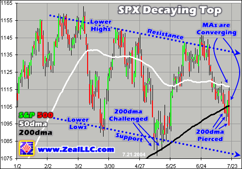
Our first graph is a 2004 candlestick depiction of the S&P 500’s trading action that we used to highlight intraday trading ranges in the SPX and their interaction with the prevailing downtrend in force. In light of both the usual closing data and these intraday candlestick range bars, the SPX is decaying in a series of lower highs and lower lows. The resulting tactical downtrend is crystal clear.
To me, this looks like a classic decaying top. Each subsequent interim high in the SPX, both closing and intraday, has been lower than its predecessors. These gradually descending short-term extremes have formed well-defined support and resistance lines that are irrefutably sloping down. This resulting bearish trend pipe is highlighted in all of our charts this week with the dotted-blue lines.
Now you fellow market junkies may get a strange sense of déjà vu as you view this pattern. I sure did! It reminds me of a similar descending trend pipe we witnessed last summer in the S&P 500. I wrote about it at the time in “The S&P 500 Interim Top”, which has a couple graphs you ought to check out.
A year ago I wrongly assumed this earlier formation was heralding lower markets but I was proven dead wrong. After consolidating between 975 and 1000 for the better part of a couple months the SPX roared to life and surged above 1150 at its latest high in February. If last summer’s decaying trend pipe preceded a major rally why couldn’t this summer’s similar pattern once again yield to a major rally? After all, the US elections are rapidly approaching and there is a widespread perception amongst bulls and bears alike that the markets will rally into early November.
While fractally similar at first glance, there are actually some enormous foundational differences between today’s SPX chart and that of a summer ago.
First, the duration of our current downtrend is far greater than last year’s. So far in 2004 the S&P 500 has spent almost six months grinding lower. Last year’s downtrend only lasted about six weeks, or one quarter of our present pattern’s duration. In general in the financial markets, the longer that a given trend has been in force the more powerful and decisive that trend will prove to be.
Would you feel more comfortable trading with a trend that was three weeks old or three years old? So far our current S&P 500 downtrend has persisted about four times as long as last year’s suggesting it is much more important in the grand scheme of things. Like all trends, this SPX pattern gains more credibility with age.
Second, the behavior of the S&P 500’s key 50-day and 200-day moving averages is far more ominous today than it was a year ago. Last summer the S&P’s downtrend only fell slightly below its 50dma for a couple weeks or so, and the 50dma itself remained far above the 200dma. In addition both the 50 and 200 continued rising strongly last summer all throughout the SPX’s downtrend pattern.
Our current SPX downtrend’s interaction with its moving averages is vastly different. Since March, the 50dma has actually been grinding lower, with the SPX’s downtrend pipe centered around it. Today the S&P 500’s 50dma is actually within spitting distance of its slower 200dma. A great deal of traders consider a major cross of the 50 and 200dmas of any market to be an important sign, so if the SPX’s 50 falls under its 200 the ranks of people expecting lower markets could swell dramatically leading to more selling.
Today these crucial 50 and 200dmas are only 1.0% apart! A year ago there was far more bullish breathing room when these moving averages, both rising, were running about 8.1% apart. If the S&P 500 continues down towards its lower support line in the weeks ahead, there is a good probability that today’s contracting 50 and 200 gap will totally implode. If it shrinks to nothing and the descending 50 crosses under the 200, technically-driven selling in both S&P component stocks and S&P futures could accelerate dramatically.
Finally, today the mighty S&P 500 is actively challenging its most crucial foundational bull-market support at its 200dma. 200dmas are always the ultimate technical dividing line between bull and bear. The last time the SPX traded materially under its 200 was way back during the latest major interim lows in its Great Bear straddling the final months of 2002. Due to the very mathematics of the moving averages, a market trading under its 200dma for a period of time is almost always a bear market.
As you can see above, back in May the S&P 500 first began challenging its major 200dma support on an intraday basis, but it held strong. After kissing it during a few trading days, all three ended up closing off their lows keeping the headline S&P 500 close a bit above its 200. Just this week though this sacred line has been tentatively broken, with several closes under the 200dma.
If you look at the last red candlestick in this graph, Wednesday’s data, it is interesting that it pierced through this crucial 200dma support like a hot knife through butter. The longer that the S&P 500 trades below its 200dma cyclical-bull-market support, the more psychological damage will be done to technically oriented stock and index traders. And if this ultimately drags the 50 under the 200, then folks in the bullish camp will start growing really nervous!
Thus, while similar visually from a fractal perspective, our decaying stock top of 2004 is quite different on multiple fronts from what we witnessed last year. Today’s pattern is bigger, has been running longer, and has broken down through the SPX’s critical moving averages. In one word, the best way I can describe these technical developments is ominous.
Although tactical technical analysis centers on price charts, secondary technical data can either strengthen or weaken the primary technical case. In order to seek some secondary confirmations of the precariousness of today’s US stock markets, we also examined volatility, volume, and internal index strength. All three of these side indicators are also broadcasting bad vibes and buttress the bearish case evident in the S&P 500 price chart above. Let’s start with volatility.
Amazingly enough, the anomalously low volatility in the stock markets I discussed last month has fallen even lower! A descending wedge has formed with its sharp edge already below 0.5% 10-day absolute interday volatility, which is about as low as the S&P 500 ever goes on a 10dma basis historically. This abnormally low volatility is a telltale bearish sign that supports the ominous interpretation of the SPX price chart itself.
Like so many things in the markets, volatility profiles are like a giant pendulum. High volatility times are followed by low volatility times as the pendulum swings back, and these low volatility times then inevitably give way to high volatility times again, back and forth perpetually. Today’s anomalously low volatility will be followed by high volatility, there is no doubt. And herein lies the bearish interpretation.
A breakout from the volatility descending wedge shown above will have to explode to the upside, towards higher volatility. Historically the S&P 500 never lingers under 0.5% on a 10dma basis for long, and this time is unlikely to prove to be the one exception. In addition, volatility cannot fall to zero. Absolute interday volatility treats both a -1% and +1% day in the S&P 500 as a 1% move, so very low readings are not possible due to the absolute-value conversion. As long as we emotional humans are involved in the markets, there will be serious volatility.
So when volatility inevitably breaks out higher and the pendulum swings back out of this anomaly, there is a 90%+ chance that the S&P 500 will move sharply lower. Just as in this chart, volatility tends to wane during rallies but jump sharply when the markets start falling and folks grow nervous. If you check out any long-term volatility graph these well-established tendencies are crystal clear.
In addition to the SPX piercing its key 200dma six months into its decaying top, its unnaturally low volatility is a fuse waiting to be lit. High volatility will follow low volatility as inexorably as night follows day, and the vast vast majority of the time surges in volatility accompany selloffs in the stock markets. The coming upside breakout of the anomalously low S&P volatility will almost certainly coincide with a sharp move down in this flagship index and the US markets in general.
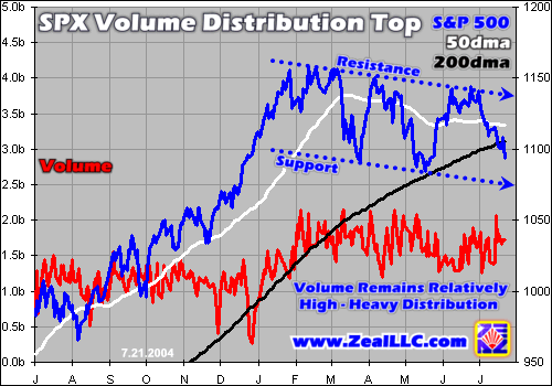
Provocatively volume also augments the bearish message of these price charts. Relatively heavy volume during a decaying top on the charts is a telltale sign of churning and distribution, suggesting that big players are unloading equities at a furious pace.
Trading volume is an interesting auxiliary technical indicator. On the chart above, you can see that SPX volume averaged between 1.0b and 1.5b a day during last year’s cyclical bull market. But, since the S&P 500 peaked in early February, volume has been much higher generally meandering between 1.5b and 2.0b per day, or 33% to 50% higher.
Higher volume considered in isolation is not necessarily bullish or bearish, but when examined in the context of price trends it can be revealing. The major increase in volume this year relative to last year was accompanied by the decaying topping pattern in the S&P 500. Therefore even accelerated trading, the prize that Wall Street covets the most since it earns commissions on all trades, has not been able to push the SPX higher even after six months.
On the contrary, this higher volume coincides with decaying prices suggesting that, on balance, there are more offers to sell stock than to buy it. Whenever sell orders outweigh buy orders, the prevailing prices must fall until a new market-clearing equilibrium is established at a lower price. In 2004 as hours turned into days then weeks then months, the S&P 500 prices have continued to fall so the high volume is apparently decidedly bearish with sells outnumbering buys on balance.
Higher volume over a half year with decaying prices looks like a textbook distribution. A distribution occurs when big market players first drive up stocks as high as they can in an attempt to get the public interested. Once the public is excited, the big players begin gradually systematically unloading their positions to the public, selling as much as they can at any given time without tanking the markets. Once the distribution is finished, the big players have cashed out and the public is left holding the bag before the fall.
A century ago legendary speculator Jesse Livermore had much to say about distributions in “Reminiscences of a Stock Operator”. He said, “Usually the object of manipulation is to develop marketability – that is, the ability to dispose of fair-sized blocks at some price at any time. … In the majority of the cases the object of manipulation is, as I said, to sell stock to the public at the best possible price. It is not alone a question of selling but of distributing.”
Livermore continued, “Stocks are manipulated to the highest point possible and then sold to the public on the way down. … When it came to the actual marketing of the line he did what I told you: he sold it on the way down. The trading public is always looking for a rally…” Livermore wisely pointed out that the only way for big players to liquidate huge positions at decent prices is to attempt to drive a price higher and then start unloading to the public on the way down once the price stops moving higher. This strategy is as old as the markets.
In our current S&P 500 chart, note that volume was relatively low until February of this year, right as the SPX hit its latest interim top. Three attempts were made in rapid succession to rally the index significantly above 1150, but all three failed in January, February, and March. It is interesting that just as this topping was occurring that trading volume would soar by 33% to 50% on average. It is even more curious that this massive increase would persist for the next six months!
What if big players, maybe Wall Street banks, maybe corporate insiders, maybe hedge funds, fully realize that the Great Bear in US stocks never ended? Historically Great Bears don’t end until stocks are fundamentally undervalued in P/E and dividend-yield terms, and we haven’t even come anywhere close to undervalued today yet. What if they suspect that the cyclical bull market of 2003 was just another powerful bear-market rally ahead of a vicious downleg?
If so, they would want to unload their long positions in general US stocks to the public (via mutual funds or individual stock purchases) before the next major downleg commences. As Jesse Livermore astutely pointed out a century ago, the best way to do this is to rally the markets as high as they want to go, and then start selling on the way down into the decline. But this distribution selling must happen gradually over time so it doesn’t take the markets down too fast before the big players’ positions are unloaded.
I don’t know for sure if this is indeed a classic distribution from big players to the public, but its volume profile sure looks like it! How else could the persistently low volume during last year’s rally and the persistently high volume during this year’s decay be explained? Provocatively, US corporate insider selling has reached nearly unprecedented levels in 2004 as well, strongly suggesting that the inside guys don’t think the markets are headed higher in the coming year or two.
In order for this volume profile to be bullish, it would have to be flipped. If players really believed in the markets, the volume ought to be heaviest on the way up in 2003 as players of all sizes bought positions ahead of an expected multi-year bull market. And the consolidation in 2004, in order to be bullish, should have been lower volume as players rested and waited for their accumulated positions to start rallying again. Instead, we see far more conviction and volume during the decaying top and not a lot during last year’s rally.
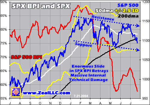
Combined with the ominous stock technicals, the distribution-like volume profile in the S&P 500 is not encouraging. In a broad distribution ahead of a major Great Bear downleg, we would expect to see broad selling of almost all stocks, not just weakness in the headline market darlings that dominate the indices. Indeed, if we look at the S&P 500’s Bullish Percent Index, we do see widespread internal decay across the entire elite S&P 500.
The S&P 500 Bullish Percent Index records what percentage of all S&P 500 component companies’ stocks are exhibiting technical point-and-figure buy signals on their individual charts at any given time. The SPX BPI peaked way back in late January, just ahead of the S&P 500 itself, at a mindblowing 88.8%! This means that nearly 90% of all the 500 SPX companies had bullish P&F buys on their respective price charts. Talk about a greedy sentiment extreme!
Since its own early 2004 top, the S&P 500 has only slid 5.5% as of Wednesday of this week. This modest headline action is the primary factor lulling folks into complacency on these exceptionally dangerous 2004 markets. But if we look at the S&P 500’s BPI, the internal damage done to the component companies has been nothing short of catastrophic. Peak to trough in 2004 the SPX BPI has already plunged by over a third from 88.8% to 57.6%!
During last summer’s S&P 500 consolidation lower, its BPI only fell by a tenth or so from 82.8% to 73.4% before recovering and surging higher into early 2004. Thus there is simply no comparison between what we witnessed last year and the widespread carnage evident today. The selling that is dogging the S&P 500 has not been limited to modest selling in the couple dozen huge companies that dominate this market-capitalization-weighted index, as SPX components across the board are being actively dumped.
For each of the 500 companies represented in this ultimate proxy for the US stock markets, it takes targeted individual selling in them alone to cause their individual point-and-figure price charts to no longer show buy signals. With the absolute 31.2% drop in the SPX BPI since January, this means that 156 S&P 500 component companies have already experienced individualized heavy selling so far in 2004. The internal damage being done by this decaying S&P 500 top has been enormous, even while the headline index remains deceptively placid.
And major S&P 500 bottoms in recent years have not been witnessed until the SPX BPI trades below 20%, sometimes well below. At just under 60% today we obviously have a long way to go yet, a lot more selling ahead, before we are blessed to experience another major interim bottom along with its tradable V-bounce.
In addition to the S&P 500 piercing its own 200dma for the first time in its cyclical bull this week, the brutal internal damage being wreaked in the index as evidenced by its huge BPI slide in 2004 concerns me the most. If we were just witnessing a bull-market consolidation instead of a major trend change then the SPX BPI would have been very unlikely to fall so far so fast. Unfortunately the US stock markets are decaying from within.
The bottom line is the current US stock-market technical situation looks ominous at best. It appears that a significant slide or outright Great Bear downleg is brewing, in spite of the tremendous popular complacency and general feelings that the markets are in relatively good shape.
This week the S&P 500 fell below its crucial 200dma support for the first time in this bull to date. This warning is being compounded by unnaturally low volatility that inevitably has to leap higher soon. And high volatility is almost always spawned only during sharp selloffs.
On top of all this, heavy selling from big players and insiders is relentlessly driving the markets lower. It looks like a classic distribution top where big guys unload their positions to little guys on the way down ahead of a major market decline. This apparent distribution is obviously widespread as well, as the enormous slide in the SPX BPI betrays rampant internal damage in the very heart of the index.
In light of all of these ominous stock technicals, it is probably not wise to be heavily long the US stock markets at the moment.
Adam Hamilton, CPA July 23, 2004 Subscribe |
|||||||
|
|
|
|
|
|
|
|
|
|
|
|
|
|
|
|||