|
|
|||||||
|
|
|
|
|
|
|
|
|
|
|
|
|
|
|
|
|
|
|
The Dow Doldrums Adam Hamilton February 2, 2001 3317 Words
The doldrums are a massive belt of typically calm air that envelopes the earth at the equatorial seas. With a center straddling the equator, the doldrums are hemmed in to the north and south by the trade winds. Long the bane of the mighty tall sailing ships of history, the doldrums are typically marked by an almost complete lack of winds, creating a sense of tranquility in the midst of boiling oceans. When these periods of extended calm materialize, sailing vessels have been trapped for weeks, as there is no wind to fill their sails and push them on to their ultimate destinations.
Somewhat paradoxically, the usually light variable winds of the doldrums become the breeding ground for the most awesome storms seen on earth. These leviathan atmospheric disturbances are the hurricanes, typhoons, or cyclones, as the generic names of these monstrous storms vary depending on what part of the globe in which they spring up. The very calmness of the doldrums is what spawns the mega storm systems of unfathomable power.
Vast amounts of solar radiation zip through 93m miles of space and slam into the earth’s equatorial oceans eight minutes after they leave the chaotic fusion inferno of the surface of the sun. This energy causes the calm seas of the doldrums to heat up, and ocean water begins to evaporate. As the water evaporates, the low winds fail to disperse the muggy water vapor and clouds rapidly form in the azure skies. The warm, ultra-humid air condenses at higher altitudes and the smaller clouds gradually collide to form thunderstorms and supercells. Eventually, if enough of these young aggressive weather systems meet in the same place, a major storm is born.
It never ceases to amaze that the calm, warm, sometimes windless waters of the doldrums are the breeding ground for the most violent and forceful atmospheric events of the hydrologic cycle.
Like the doldrums that many a sailor has cursed, the Dow Jones Industrial Average has seemed to drift listlessly since 1999, with no winds filling its sails. At the top of the NASDAQ mania last year, a curious psychological event where form mattered more than substance, the venerable Dow was all but forgotten. As when a second baby is born, the attention of the beaming second-time parents focuses on the exciting new baby and the firstborn child feels neglected for awhile, the DJIA seemed to fade into the background in late 1999, when Greenspan’s Y2k liquidity blitz fueled the biggest speculative bubble of all time in the upstart NASDAQ index.
As the esteemed Dow no doubt feels neglected since the common perception now seems to indicate the NASDAQ is the new benchmark US stock index, we want to digress from the always entertaining NASDAQ antics and exciting commodity markets to take a fresh look at the stale Dow. How is it doing? How are the fundamentals of valuation holding up? Where might it be heading? And is a storm brewing in this atypical market calm?
Even though the Bubblevision spotlight is still largely on the tech-laden bells and whistles of the sexy NASDAQ, it would be extremely difficult to find a speculator or trader who does not closely follow the Dow Jones Industrial Average. Worldwide, the thirty blue-chip companies that make up the DJIA are collectively the most important barometer of stock market performance on the planet. Traveling around the world, it is really interesting to note that traders, regardless of the countries in which they reside and trade, always monitor the pulse of the Dow as a proxy for the American equity markets as a whole.
Since 1999, when the Dow mega-rally ended and the aimless drifting in the doldrums began, the Dow has largely traded within a tight 10% band between 10000 and 11000. The DJIA has loitered so long in these warm calm seas that it just seems “natural” by now… almost as if that is where the Dow was destined to be. Yet, in trading as in life, it is always critically important to search for the longview. When one has a strategic lay of the land, it is easy to figure out where they need to go to get the necessary tactical details to execute their plans and continue marching forward to a valuable strategic goal. But, if one is limited to a tactical view, they can lapse into a situation where it is impossible to distinguish the forest from the trees.
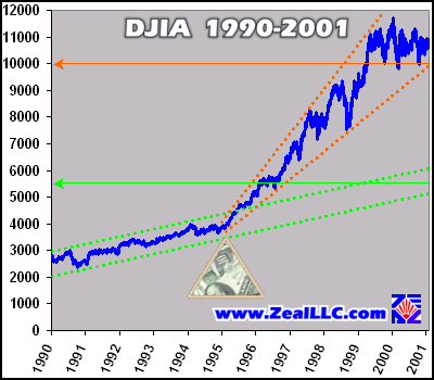
The flow of knowledge from a “God’s eye” strategic view to a practical tactical plan of execution is natural, but the flow of knowledge from a limited tactical view to an overarching strategic perspective is virtually impossible. Since Dow 10800 seems so “normal”, the first graph offers this crucial strategic perspective to step back and gain a better understanding of where the DJIA trades today. It is comprised of daily DJIA closes from January 1990 to January 2001…
When viewed from an eleven year longview, the first important bit of information that leaps out of the graph is the massive and dramatic change in the slope of the DJIA that occurred in 1995. This is marked above by the fulcrum. All kinds of interesting developments occurred in 1995 that are probably highly significant in explaining this DJIA mid-sea course change. The most important, however, has to do with the rate of growth in the broad M3 money supply in the United States.
As fiat money is created out of thin air by the magicians at the United States Federal Reserve, the aggregate money supply increases. When more money chases after the same amount of goods and services, inflation occurs. The popular media definition of inflation, rising prices, is myopic and incorrect. From the time-tested historical perspective offered by the legends of the Austrian school of economics, the true definition of inflation is more money being injected into an economy that has to compete for a finite amount of goods and services.
When this excess money finds its way into food and energy, consumers cry foul, governments make threats, and everyone gets up and arms and upset. The media rails about the “inflation”. Yet, if the same excess money avoids tangible goods and sloshes into the paper financial markets, most people are thrilled as the excess money bids up stock prices to unreasonable valuation levels. The media revels about “wealth creation”. The palpable contradiction is incredible!
In 1995, the US M3 money supply took off like a rocket, and this correlates perfectly with the fulcrum point noted in the graph above in the DJIA action. For a graph of this incredible correlation, please click over to our earlier “Gold Boiling in Oil” essay. The second graph in that earlier essay shows the M3 graphed with the S&P 500, and it helps illustrate the correlation between money supply growth and financial asset inflation. The relationship is readily apparent and unassailable.
Also important, 1995 is notable as the date mentioned in the landmark lawsuit filed by attorney and Bank for International Settlements shareholder Reginald Howe. Mr. Howe’s groundbreaking legal action against the large gold shorts offers compelling evidence that late 1994 to early 1995 was the period of time when the US and British governments joined forces with the large bullion banks to artificially suppress the global gold price. The lawsuit is highly recommended and fascinating reading, and it explains the motivation, perceived necessity, and methodology of this abominable anti-free market action.
The more one studies the global markets, the more impressive the degree of interrelations and causal relationships becomes!
Back to the Dow for now, the above graph also shows two distinctive trend channels over eleven years. The first is marked by the light green dotted lines, and the DJIA pulled up and climbed out of this original channel on afterburners right at the fulcrum point. If these trend lines are extended forward to today, they can be used to extrapolate the DJIA growth of the first half of the 1990s to the second half of the decade. The green arrow notes the center of this original trend channel as of January 31, 2001. Barring the obvious structural change in 1995, the DJIA would have been trading between 5000 and 6000 today if it had not curiously jumped the tracks in 1995 and headed north into a stratospheric new ballistic growth trajectory.
The light red dotted lines mark the new trend channel established by the mammoth course change in 1995. For the most part, except during the LTCM / Russian debt crisis in 1998 and the blasé trading range of late 2000, the DJIA has remained in upper half of this ever-widening cone. This formation is also known as a megaphone or trumpet. It can indicate increasing tension between those who hold diametrically opposed views of where a market is heading, and often marks strong sustained trends. Technical breaks from megaphones are not easy, but when they occur the resulting move is usually also strong and sustained.
Interestingly, the support at the base of giant megaphone is around 10000 today, as shown by the red arrow in the graph. It is an intriguing coincidence that THE critical psychological support level of 10000 coincides with a crucial technical baseline established since the wild DJIA course change initiated in 1995. And the steep slope of this lower red dotted line indicates that the support necessary to maintain this rapidly ascending trend is constantly rising. The further forward we plunge through the sands of time, the closer the DJIA comes to crashing through this important support line even if it continues trying to sail in the warm doldrums, bound in the same trading range as its sails hang limp from the lack of financial winds.
The most important piece of information to glean from the longview is that the seemingly comfortable 10000 to 11000 pipeline in which the DJIA is bouncing around these days is historically unprecedented and the steep Himalayan K2 it ascended to get there is not a “normal” Dow growth rate. Strategic perspective is invaluable!
Now with the benefit of a strategic perspective of the DJIA meanderings since 1990, we will zoom in to a more tactical one year view. During the period of time from January 2000 until the present, the Dow maintained the tight trading range to which we have all grown accustomed, largely between 10000 and 11000.
The Dow, unlike the NASDAQ, is not market capitalization weighted. The level of the DJIA is a direct function of the price of the 30 companies trading in the index, adjusted for splits over time. When the dollars lost off the respective share prices of these Dow companies exceed the dollars gained by other Dow stocks increasing in value, the DJIA falls. And of course the opposite is also true. As the DJIA level is a direct function of its member companies’ stock prices, the foundation of the whole DJIA index is the valuations of the individual companies comprising the index. When the valuations of these companies change, by mathematical necessity the DJIA will follow suit.
The most common way to measure the valuation of any company is the old, though much maligned these days, price earnings ratio. P/Es are exceedingly simple to compute, as all one has to do is take the current share price of a company divided by the latest annual earnings per share. That’s it, nothing to it!
In equity markets in many different countries all throughout history, the long-term average P/E ratio is around 13.5x. The inverse of the P/E ratio, in this case 1 divided by 13.5, equals the rate of return a given P/E represents… around 7.4%. Over centuries, 7.4% has proved to be a remarkably reliable benchmark rate of return. It is easy to understand why with a simple example…
Assume there was a house coming up for sale in your neighborhood, and you were interested in buying it solely as a rental property. Let’s imagine you pay $100,000 cash for the house. What is a good rate of return on your investment?
If your local market is saturated with rental properties, you may only be able to ask $1,000 for annual rent from your new real estate investment. A $1,000 annual return on a $100,000 investment is obviously 1%, or a P/E of 100x. If you were to buy a $100k rental property that was only able to generate $1k per year, it would be a dismal investment! After all, why not just put the $100k in a bank where you can at least earn 3% and triple your return and eliminate the stress of dealing with unruly tenants?
Now imagine a second scenario, where you buy the same neighborhood house for $100k cash. For whatever reason, say a tornado leveled the other side of town or a new oil boom was underway, let’s assume you can rent that house for $50k per year. This, of course, is the equivalent of a stellar 50% per year return on your capital and a P/E of 2. Would you make this investment? Heck yes!
Of course, since a 50% annual return is so incredibly attractive, this anomalous rate of return would cause a massive increase in home building and sooner or later there would be an oversupply of rental properties as others sought to replicate your wild and crazy returns. In this example, over time, average returns would ultimately regress to a mean of around 7% to 8%, representing P/Es of roughly 13-14.
Stocks have shown, over and over and over again throughout history, that, on long-term average, they will have a rate of return of around 7% to 8%, hovering around a P/E of 13.5. This has been proven by the crucible of time to be the ultimate equilibrium level of equity valuation multiples.
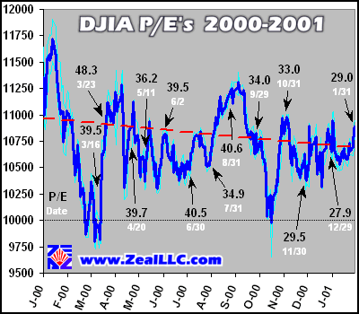
Armed with this important historic perspective, the graph below outlines P/E ratios for the DJIA as of various dates in the last 13 months. The P/Es are market capitalization weighted, meaning that P/Es of Dow companies worth $300b in the stock market have three times as much weight as P/Es of Dow companies worth $100b in the stock market, for example. Using this market capitalization weighting, even though the DJIA is not a market-cap weighted index, is useful because it is a more faithful representation of the valuation levels at which investor capital is really deployed. The dark blue line is the DJIA daily closing, and the light blue lines mark the daily trading ranges of the Dow 30…
Like the linear trend of this data series (marked by the dashed red line), the trend of the P/E ratios is generally declining. This is totally expected for an index that is trading flatly in normal economic times because the companies that comprise the DJIA tend to increase their earnings each year. So, if share prices are relatively constant and earnings rise, P/E multiples shrink.
Because of the market capitalization weightings, the P/E trend is not always intuitive over a short sample time period. For instance, on June 30 the DJIA market-cap weighted average P/E was 40.5, but one month later, even though the DJIA was higher, the P/E was much lower at 34.9. These fluctuations occur as the relative market capitalization (share price times shares outstanding) of individual Dow components changes. For instance, if a usually high P/E stock like Intel or Microsoft with a large market capitalization is rising in price as people buy more shares, the market-cap weighted P/E will rise even if the DJIA declines. Conversely, if beaten down stocks like General Motors gain more relative market capitalization than the higher P/E stocks, the market cap weighted average P/E will fall even if the DJIA is rising. Short-term, there is a lot of noise in this valuation measure, but over time the trend that is established can be a very valuable diagnostic tool.
This P/E multiple compression we observe here is expected, but the important question becomes… is it enough?
As the NASDAQ deteriorates and more and more mainstream analysts grudgingly admit it was a speculative mania bubble, the DJIA is regaining its one hundred year plus reign as THE prominent US equity index. The near future direction of the Dow, whether higher, lower, or flatlined in its multi-year trading range, is very important as it will be a benchmark against which investor psychology will be galvanized. If the Dow rallies dramatically in Greenspan’s new easing cycle, the bulls will herald that the soft-landing has arrived and all is well in the markets. If the Dow plummets, however, it will spook and frighten professional and amateur players alike, and will feed on the negative NASDAQ psychology that has been slowly festering since its crash last spring.
Because valuations ultimately always regress to the mean 13.5x earnings, one of the most compelling cases that can be made for future DJIA direction surrounds its current valuation multiple. At 29x earnings, the DJIA is currently 115% overvalued from a strategic historical perspective. In order to trade around 13.5x earnings, the DJIA would have to fall to the low 5000s to be considered fair valued. Does this 5000 number ring a bell? In the first graph of this essay, that is where the original DJIA early 1990s trend channel intersects with the present moment in time! Funny how these technical and fundamental benchmarks converge and support each other over a longer time horizon!
So, taking a strategic longview, from both a technical and fundamental perspective, the inevitable conclusion drawn is that the Dow is STILL dramatically overvalued, and has not even yet begun the bubble deflation process that the NASDAQ was running point on in 2000. The DJIA, comprised of the current companies with their current earnings, would need to plummet to the 5000 range to be fairly valued.
This 5000 number will probably be dropping, however, as the dramatic slowdown in the US heralded by the plunging National Association of Purchasing Managers and Gross Domestic Product reports clearly show. In a recession, earnings generally fall. In the P/E equation, when the price stays the same and earnings shrink due to a harsher and more unforgiving business environment, the P/Es of individual companies will rise, making the DJIA trading at 10000 to 11000 even more overvalued than it is now.
Even more food for thought… historically major market bottoms were marked by P/Es of one HALF the normal level, or around 7x earnings. To trade to THIS miserable valuation, the DJIA would have to plummet below 3000. Although it seems like centuries ago, we have seen these levels on the Dow in the early 1990s, and there is no technical reason why it could not test these levels again in the next couple years.
As the Dow continues drifting in the doldrums, “da bulls” and “da bears” are calling their bookies and taking sides on the next great financial game about to unfold. Although some euphoric “what the heck!” rallies are possible as Greenspan and crew desperately slash interest rates to the point of giving away free capital to invest, our money is firmly on the bears. With crucial valuation fundamentals and historic technicals pointing to much lower Dow levels, we believe there is a very high probability that the DJIA will be much lower at the end of 2001 than its lofty current trading range in the doldrums.
Just as raging hurricanes are born in the calm equatorial doldrums, one of the next phases in the ongoing bubble deflation will likely be a capital-threatening DJIA slide nurtured in the current Dow doldrums. The fear and terror that will grip the popular investor psyche during the coming storm as the Dow plunges through the millennial markers in possibly rapid succession will be an awesome sight to behold.
Adam Hamilton, CPA February 2, 2001 Subscribe |
|||||||
|
|
|
|
|
|
|
|
|
|
|
|
|
|
|
|||