|
|
|||||||
|
|
|
|
|
|
|
|
|
|
|
|
|
|
|
|
|
|
|
Gold Buy Signal? Adam Hamilton September 15, 2000 3381 Words
Like the old cliché about skinning a cat, there are a plethora of frameworks available to analyze global markets and investments. Some have proven more successful over time, and some have proven less successful over time, but many can provide valuable and unique perspectives on markets. At the highest level, these methodologies can be divided into those based on fundamentals, and those based on technicals. Fundamental analysis embodies the ultimate in strategic thinking. Fundamentalists attempt to step back and take the long view, factoring in every possible shred of macro information that can affect an investment. They focus primarily on broad-scaled dynamics, including supply and demand, the current market environment, the psychology of investors, prevailing valuation levels, history, and many other large factors. The technicians represent the second principal school of thought of market analysis. Technical analysis is much more tactical and focused than the open ended fundamentalist camp. Technicians focus on specific patterns in charts, and look for recurring patterns that have been identified through decades of observation. They believe that chart analysis is the Holy Grail for finding investments ripe for a new long or short position. Both the fundamental and technical perspectives on market analysis have proven incredibly valuable in trading history, and both can lead to fantastic gains if properly employed.
Theoretically, the best of both worlds may be attained by merging fundamental and technical analysis… by using one school of thought to buttress the other. As many fantastic essays have been recently written by brilliant analysts from around the globe about the incredible bullish fundamentals of the current gold market, we will attempt to drill down and take a look at gold from a specific technical perspective. With crucially important fundamentals such as global physical gold supply and demand, gold valuation levels, oil, monetary inflation, equity overvaluation, and many others highlighting the incredible opportunities in gold, it can be a great second witness to analyze the gold charts. If technical paradigms reinforce the bullish fundamental case for gold, a virtually unassailable case builds for an imminent bull market in the long spurned metal of kings.
One of the more interesting areas of technical analysis is intermarket analysis. Sometimes, one market may act as a leading indicator for another. This idea is also important from a fundamental perspective, and is easy to understand. For instance, as oil continues to rise in price, gold becomes more and more historically undervalued in terms of oil, indicating a move upward in gold is highly probable to catch up with oil and other important commodities. Currencies can also have important implications for other markets. Individual investments in every market in the world can be denominated in any currency. Everything else being equal, as one currency rises in value, others fall in their relative purchasing power in terms of the rising currency. From a gold standpoint, one simple form of intermarket technical analysis is to chart the metal vs. the US dollar. As gold is denominated in dollars, there is a huge negative correlation between the price of gold and the US dollar. As the dollar falls in value, gold rises in price in dollar terms, and as the dollar rises in value, gold falls in price in dollar terms. The dollar gold relationship is well documented, but it is not a very effective leading indicator. The dollar and gold tend to move in opposite directions in lockstep unison, although in recent years that relationship has diminished in intensity due to the gold carry trade and Machiavellian machinations occurring in the global gold market. The next leap up in complexity in intermarket technical analysis is to compare MORE than one other market to gold. Conceptually, this can be accomplished mathematically and even plotted on a three-dimensional graph, but it is difficult to understand and analyze without an advanced mathematics background. By substituting a ratio between two of the three variables plotted for the two original variables, the three markets in the analysis can be distilled back down to two dimensions, and easily analyzed in conventional graphs. By analyzing three markets at once, unique leading indicators for gold can be discovered.
A leading indicator, by definition, tends to move before gold rallies, and sometimes provides a warning buy signal before the metal begins a new rally in earnest. One such leading indicator is the Deutschemark / Swiss Franc ratio (DMSF). The German Deutschemark and Swiss Franc are important international currencies, although the misguided political experiment of the cratering zero (uh, Euro) has caused the roles of these once mighty currencies to unfortunately diminish somewhat in recent years. The history of both currencies is very fascinating and is a highly recommended field of study, from the hyperinflation in Germany in 1922 to 1923 (and its implications for all the unbacked fiat money in which the world is drowning today) to the historic impregnable strength of a once gold-backed Swiss Franc. Unfortunately, a study of these two currencies’ modern history, which provides fascinating insights into money and gold, is outside the scope of this essay.
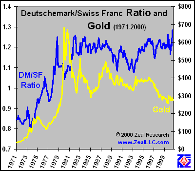
The DMSF ratio is very simple to calculate. The Deutschemark (DM) and Swiss Franc (SF) are each converted into US dollars, then the DM value in dollars is divided by the SF value in dollars, yielding the DMSF ratio. If the DM increases in value relative to the SF, the ratio rises. If the DM decreases in value relative to the SF, the ratio falls. In this essay, we will perform a cursory and high-level walk through 30 years of data to attempt to determine if the DMSF ratio may be a valid leading indicator of imminent rallies in gold. Although monthly closing data is used throughout this essay exclusively, the same relationships can be analyzed in much greater detail and superior precision using daily trading data. The three decades of raw data appear in the first graph…
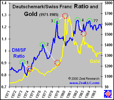
Even from this eagle-eye view, the data is already interesting, appearing to support the hypothesis that the DMSF ratio moves up before the price of gold. If the yellow gold line were shifted to the left and the vertical scales fine-tuned, it would fairly closely track the blue DMSF ratio line. The above graph, however, is fairly busy and it is much easier to observe and analyze the data if it is split into smaller temporal slices. Three further graphs below outline the first 15 years of this period, the second 15 years of this period, and finally zoom in on 1999 to today. First, let’s look at the early data, the DMSF ratio and gold from 1971 to 1985…
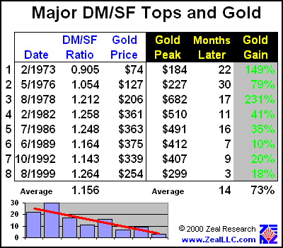
Four significant tops in the DMSF ratio can be observed in the graph above, with one further questionable top. The first DMSF top is labeled with a “1” in the graph, and surrounded by a green circle. Following DMSF top 1, gold appreciated 149% in 22 months, starting from the date of the DMSF top. (All the specific DMSF topping dates and subsequent gold rallies are outlined in a table later in this essay.) DMSF top 2 in the graph coincides almost EXACTLY with a low in gold (the actual offset in the raw data is three months… gold bottomed at $109 exactly three months after the DMSF top of 1.054 was attained). From this second DMSF top, gold gained 79% over 30 months, the longest lagging rally found in the data. Interestingly, one can make the case that the DMSF rally 2 is actually a precursor to the HUGE DMSF rally 3, but it IS interesting to note that the termination point of the gold rally marked by DMSF rally 2 (the dotted red circle connected by the white line to the DMSF top 2 in the graph) coincides very closely with a temporary pullback in gold as it marched relentlessly northward in its monster 1979 rally. DMSF top 3 is the result of the largest rally of the DMSF ratio in history. This DMSF top also preceded the biggest gold rally in United States history in terms of absolute nominal dollars. If gold had been purchased on the month the DMSF ratio peaked, it would have yielded a very impressive 231% return in 17 months!
Even AFTER the mega gold rally of 1979-1980, the DMSF ratio still maintained its leading indicator relationship with gold. DMSF top 4 occurred immediately before a three year bottom in gold, and a purchase of gold at the DMSF top would have yielded a 41% return in 11 months. The next DMSF top did NOT prove to be a valid leading indicator for gold, as the yellow metal continued sinking after the DMSF mini-peak occurred (shown with “??” on the graph above). This last rally was not a decisive rally as were earlier DMSF rallies. It had a low magnitude move and it had a sort of lingering double top rather than a spike-shaped top similar to previous DMSF rallies. These factors may be helpful in explaining the leading indicator apparently breaking in this instance. Also, this final DMSF top was NOT a new high in the DMSF ratio, as were the previous four tops. Overall, the DMSF ratio proved to be an excellent leading indicator of an imminent gold rally during this period, netting average gold gains of 125% over 20 months a full 80% of the time a DMSF top was observed. Maybe those clever technicians are on to something here!
Has the relationship continued in the most recent 15 years?
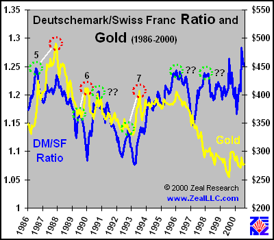
Although the leading indicator relationship between the DMSF ratio and gold was less defined between 1986 and 2000, it still existed, and it signaled most of the largest gold rallies that occurred during this period. DMSF top 5 signaled a 35% rally in gold that would last for 16 months after the buy signal was tripped. Incidentally, this DMSF top was very close to an all-time DMSF high when it occurred, and it exhibits the same characteristic sharp spike formation that the DMSF ratio tops which acted as leading indicators from 1971 – 1985 had exhibited. DMSF top 6 is a little more suspect and harder to build the case for, as it was not a long-term DMSF top and would have been hard to catch without the benefit of perfect hindsight. Nevertheless, physical gold bought on that DMSF top would have yielded a return of 10% in 7 months. (It is a scathing commentary on the speculative excesses of our times to realize that 10% in 7 months would have once been generally considered a very healthy return before the gangbusters NASDAQ days of late 1999 to early 2000!) The next intermediate DMSF top (right after 6 marked with a “??” in the graph above) would have yielded a false buy signal on gold, as the gold price dropped steadily for several years. DMSF top 7, like DMSF top 6, is also suspect as it is an intermediate high nowhere near an all-time top, but it also provided a valid buy signal for gold, yielding a 20% return in 9 months. Two more DMSF tops occurred before 1999, but both were indecisive, multiple lagging tops, and not the characteristic DMSF spike that heralded seven previous rallies in gold. In addition, an important fundamental fact must not be forgotten as we plow forward in our technical analysis … the gold carry trade began in earnest in 1995, initiating a steep five year slide in the price of gold. With physical gold being dumped at unnatural and unsustainable rates as central banks began to loan out their bullion for speculators to sell on the open market, a rally in gold was virtually impossible. Without the manipulation of the supposedly free market by governments trying to protect and hide their rapidly depreciating fiat currencies and bullion banks driving the price of gold lower to finance their equity market adventures, the gold price graph would have been VERY different over the last five years. This begs the question, is the DMSF ratio as a leading indicator for gold dead? Or just playing dead? The final graph outlines the monthly data from early 1999 to the present…
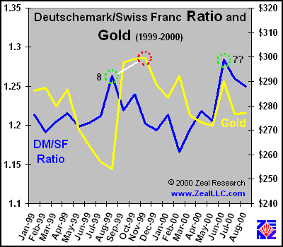
Although the scale on this graph has been blown up to accentuate the relationship between the DMSF ratio and gold, it is important to realize that DMSF top 8 was an all-time high in the DMSF ratio. Incredibly provocatively, this DMSF top signaled the exact bottom in the price of gold last August, immediately before the fantastic $80 rally in the yellow metal. Using this DMSF top as a buy signal would have yielded profits of 18% in three months (using monthly data). If DAILY data is analyzed, the returns would have exceeded 30% over a mere couple weeks. As in the early DMSF ratio rallies preceding the 1980 gold mega-rally, this DMSF top was sharp and defined (it can be seen in proper perspective in the prior graph, 1986 – 2000), and DMSF top 8 signaled an all-time high of the DMSF ratio. It is also crucial to note, almost a year later, that a NEW all-time high was breached in June 2000 in the DMSF ratio! (marked with “??” above) Is this a NEW buy signal for gold? Before we further explore that question, let’s take a quick look at the summary of the DMSF rallies that signaled valid gold buys thus far…
On average, the DMSF ratio successfully signaled gold rallies that resulted in 73% gains occurring over 14 months in physical gold. These eight DMSF tops proved to be valid buy signals, while four other DMSF tops (all four of which were not new highs of the ratio, and three of which were not decisive spike-type tops but sloppy double and triple tops) would have yielded false buy signals. Average losses that would have accrued from buying on false DMSF tops were not calculated, as exit timing is impossible to objectively determine. For the successful DMSF buy signals, exit timing was assumed to be the monthly top of the immediately following gold rally. At first this seems aggressive, as an exact top is difficult to hit when it occurs. Yet, it is really fairly conservative as MONTHLY data was used, while an active trader at the time would have carefully monitored daily (or hourly) data. For instance, spot physical gold truly topped daily sometime during the month, and the month-end closes do not reflect this. A trader looking at DAILY data would have usually had some warning before the end of the month that a gold rally was topping out. A trader could have bought gold on all the DMSF tops and used some kind of mechanical collar for protection from missing the following gold peaks by a considerable time or percentage, such as a sliding 5% stop-loss on a particular trade. Even if the false buy signals were traded upon, the same 5% stop-loss would have provided a hard-coded exit strategy that would have protected the trader from large losses of capital due to a false buy signal. Exit strategies, good, bad, and ugly, should be planned BEFORE capital is thrown at ANY investment. They are a CRUCIAL part of intelligent speculation. Eight out of twelve major DMSF top possible gold buy signals over 30 years proving correct yields a 2/3 probability of success for the DMSF top leading indicator gold buy signal.
The inset graph in the lower-left corner of the table above shows the average lead-time until the gold rally consummation, in months, from the eight successful DMSF buy signals. The red line through the columns illustrates the linear trend of the data … DOWN. On average, the amount of time it took gold to rally after a successful DMSF buy signal has dropped dramatically. Several factors may explain this, including the remarkable increase in the velocity of information flow we have seen in the world today (markets react and move MUCH faster than even a few years ago, let alone 20), and more recently official sector efforts to cap any fledgling gold rally to protect the naked shorts. Even before 1990, however, the trend in the lead-time was down, and it still continues south to this day. This trend indicates that the DMSF top buy signal in gold IS likely still valid, but it should yield fruits in the form of a gold rally much sooner than it has historically. (at least in a truly free market!)
In light of the past data, the June 2000 all-time high of the DMSF ratio of 1.284 is very intriguing. The high was a sharp one-month spike, as all other DMSF tops in the past that have heralded major gold bull rallies have been. In addition, the very fact it was an all-time high was very interesting. The first four rallies in gold outlined in the table above were all on new DMSF all-time high tops, and they successfully signaled the strongest future gains in gold. The eighth rally was also on an all-time DMSF high, and it marked the most explosive gold rally the market has seen since the early 1990s. (the wonderful events of autumn 1999 which surrounded the Washington Agreement)
So why has the DMSF ratio signaled imminent gold rallies in the past? One possible answer is the Swiss Franc was historically legally tied to gold. When the price of gold was low, the Franc had a lower value relative to the Deutschemark, pushing up the DMSF ratio to a topping pattern. Soon after, when gold begin to rise, the hard SF increased in value relative to the fiat Deutschemark, pushing the DMSF ratio down. Hence, a ratio constructed with a fiat currency divided by a (once) hard currency should move relatively counter-cyclically to gold, potentially signaling a low in gold and an imminent rally. If this is the case, the recent ill-fated Swiss decoupling of their currency with gold may adversely affect the performance of the DMSF ratio indicator in the future. This certainly may not be THE satisfactory conclusion to explain the historical leading indicator relationship with gold, however. Please write if you have a solid theory, as I am certainly interested in learning WHY this happens. One of the great things about technical analysis, however, is the “WHY” is not necessarily important, just the chart pattern. With effectively infinite variables being distilled down into a single line on a chart (the market price of anything is affected by tens or hundreds of millions of individual people making specific buy and sell decisions, as well as innumerable other factors), discerning the specific causal relationship may be impossible.
The DMSF buy signal, even standing alone, is certainly provocative. When this technical occurrence is compared to the amazingly positive bullish fundamentals for gold, however, a very strong case can be built for an imminent rally in gold. Fundamentally, gold is at 25 year real lows, and all investments ultimately regress to their mean values. (the REAL (CPI inflation adjusted) monthly average price of gold over the last 30 years is US$518!) Markets which gold traditionally parallels, such as oil and the CRB commodities index, are aggressively attacking new highs, yet their brother in arms gold remains in uncharacteristic doldrums. The US dollar, shrugging off record trade deficits and unprecedented fiat currency growth, is reaching new and unsustainable highs, preparing gold for a leap in price as soon as the dollar quits sitting on the metal. The US equity markets are trading at valuation levels exceeding all historical speculative mania bubbles, and Wall Street is spending billions convincing the American investing public that history is irrelevant, that “this time it IS different”. Global gold demand eclipses fresh gold supplied by mines each year by thousands of tons. A record short interest has arrayed itself against gold, a CLASSIC contrarian fundamental indicator of an imminent bull market. The list goes on and on… the fundamentals for gold are the best of any major asset class in the entire world.
The collaboration of stellar gold fundamentals by technical gold buy signals such as the DMSF ratio are shouting a signal to astute contrarians around the world. The fundamental and technical analysis paradigms are converging to make an extremely convincing case that we are in store for a BEHEMOTH rally in the ancient metal of kings soon…
Adam Hamilton, CPA September 15, 2000 |
|||||||
|
|
|
|
|
|
|
|
|
|
|
|
|
|
|
|||