|
|
|||||||
|
|
|
|
|
|
|
|
|
|
|
|
|
|
|
|
|
|
|
Relativity Trading Adam Hamilton October 16, 2009 3033 Words
The ultimate key to success in all trading, both long-term investment and short-term speculation, is simple. Buy low, sell high. Excel in this, and trading the financial markets will eventually make you wealthy. But implementing this well-known proverb into your own trading certainly isn’t easy. As always, the devil is in the details.
To paraphrase Pontius Pilate’s famous rhetorical question to Jesus, what is low? What is high? In order to buy low and sell high, traders must gain insights into how to define these conditions in real-time. Without building this crucial skill set, everything else a trader achieves including emotional mastery will be for naught.
While low and high are quantified in terms of prices, context is necessary to define them. A price considered in isolation is useless, but a price considered in context offers much insight. If I tell you I bought something today for $50, you have no idea whether I got a good deal at a low price or got robbed at a high price. What if my $50 bought me a new Nintendo Wii console? What if it bought me a hamburger?
Since you generally know the price history of Wiis and hamburgers, you immediately have the context necessary to make the low/high judgment. Traders must strive to understand today’s prices in a relevant context, because only then can we make sound trading decisions. If prices are simply normal like they are most of the time, traders should do nothing. But when they occasionally get low enough to buy cheap or high enough to sell dear, traders must be ready to act.
About 7 years ago, I was looking for a simple, elegant, and effective way to quickly and objectively make low/high judgments about the markets I was trading. I tried many existing trading systems, but all were ultimately unsatisfying. They had too many rules, too many exceptions to those rules, and were too time-consuming and cumbersome to apply when the markets were moving. So I developed my own system.
I called it Relativity, because all prices are relative. The low/high question can only be answered relative to recent history. In the 5 years since I publicly introduced Relativity, many new traders have entered the markets who could really benefit from this system. And after 5 years of actively applying Relativity to my own trading, with much success and some failures, my own understanding of Relativity is much deeper.
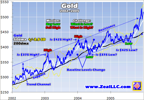
The easiest way to internalize the concepts and power of Relativity trading is to walk through an example. The gold price between 2002 and 2005 is an excellent one. Since I formulated this theory back then using this very dataset, it is certainly nostalgic for me. But far more importantly, this past example eliminates all the warring emotions surrounding today’s prices in today’s markets. Greed and fear from this historic period has long since evaporated, so everyone today can analyze it with cold logic sans emotions.
No matter where, when, or what you trade, the mission is always the same. Buy low, sell high. During the young gold bull rendered here, the contrarians then trading it faced the same challenge of defining these conditions. And clearly price alone wasn’t enough. In early 2003, $375 looked awfully high compared to the $311 gold averaged in 2002. Yet by late 2003, that same $375 started feeling normal. And by mid-2004 it felt low. Later $425 had the same high, normal, low evolution between early 2004 and mid-2005.
In any trending market, bull or bear, prevailing baseline price levels gradually change. The actual prices that feel high, normal, and low in any market today won’t feel high, normal, and low in that same market a year or two from now. It is the context, recent price history, that defines where a particular price happens to rank in the buy/sell continuum. Technical analysis, the study of price action, seeks to define this context.
Drawing trend channels is probably the most common way to put prices in context. It is very easy, like connecting the dots in a child’s coloring book. A trader manually draws a best-fit line across either all the high prices or all the low prices on a chart. Then he draws a second parallel line on the opposite price extreme to complete a trend channel. This is the space between the lines where most of the price activity occurred.
The lower line of a trend channel is called support, because whenever a price nears this line new buying tends to come in that drives the price higher (supports it). The upper line is resistance, because new selling tends to emerge near this level which keeps the price from breaking out higher (resists it). This simple technical analysis is very useful, as traders can buy low near support and sell high near resistance.
While I am a fan of technical analysis and use it a lot in my own trading, the big problem with trend channels like these is they are subjective and imprecise. Since these lines are hand-drawn, they always differ from chart to chart and analyst to analyst. And deciding when a price is low enough or high enough for action is an eye-balling exercise of guessing. There is no standard, no way to replicate the buy/sell continuum, and no way to quickly communicate low or high prices without a chart.
Trend channels have deeper mathematical limitations too. In this gold chart, the trend channel I drew encompasses a gold swing of about $60. In 2002, a $60 gain off a $275 base represented a 22% move higher. But in 2005, this same full-channel swing of $60 off a $425 base equated to just a 14% move. Over time linear trend channels distort probable percentage moves leading to poorer trading decisions. And logarithmic charts aren’t an ideal solution, they have plenty of problems of their own.
As I pondered this puzzle years ago, I was looking for a measurable, objective, undistorted standard from which to determine whether prices were low or high. And although it took me some time to realize it, the answer was staring me right in the face! The venerable 200-day moving average, rendered in black in our Zeal charts, effectively defined the ideal metric I was looking for to measure baseline price levels.
200dmas are simple constructs. Today’s closing price, along with the previous 199 trading days’ closing prices, are added together and divided by 200. As the name states, a 200dma is merely the average closing price level over the previous 200 trading days. Tomorrow, the whole average slides forward by 1 day, adding the latest close while dropping off the oldest one from 201 trading days ago.
This intrinsic math means a 200dma gradually inches ahead, trailing the price action that created it. Since calendar months typically average about 21 trading days each, a 200dma is essentially a 10-month average. This turns out to be an ideal baseline from which to measure prices. While a 200dma gradually evolves to reflect changing baseline price levels, it still morphs slowly enough to not be excessively influenced by daily volatility.
Examine the black 200dma in the gold chart above. It parallels the hand-drawn trend channel! In the secular trends that are the most profitable to trade, 200dmas are like big arrows pointing the way prices are heading. This construct’s natural smoothing effect distills away all the capricious day-to-day volatility, revealing the core essence of the prevailing secular trend. In addition, 200dmas are totally unbiased.
A thousand different analysts calculating the 200dma on the same price series will get the exact same result, this standard is rigidly objective. This is a welcome contrast to the inherent subjectivity of drawing trends, where a thousand analysts would get a thousand different results. And a price’s relationship with its 200dma can be quickly communicated without a chart. It is easier to both transmit and digest.
200dmas are the perfect compromise between static and excessively dynamic baseline-price measures. While 200dmas are slow to change, they do still gradually change over time. So they won’t fade into obsolescence like all static measures, including trendlines, inevitably will. Simultaneously, they are not unduly influenced by the latest price action (most recent few weeks) that heavily colors traders’ sentiment.
Occasionally a fellow student of the markets will ask me, why the 200dma? Why not a 175dma, or a 250dma? This is a good question, as odds are any long moving average will work in a similar way as a slowly changing baseline price level. I chose simple arithmetic 200dmas because they are common and popular, ubiquitous on almost all charts. If an atypical moving average was used, then Relativity would be more cumbersome because it couldn’t be calculated without raw data, a spreadsheet, and too much time.
The gold period charted above shows a perfect example of how useful the 200dma baseline is to traders. Anytime gold was near or under its 200dma, it was a great time to buy. Its price was relatively low compared to its 200dma. And anytime gold stretched far above its 200dma, it was a great time to sell. Its price was relatively high compared to its 200dma. This flowing and ebbing distance between a price and its 200dma is the core of Relativity trading. 200dmas provide the crucial context from which low/high judgments can be made!
The deeper your understanding of 200dmas grows, the easier it is to see why they are so venerated by technicians. In most secular bulls like this gold one, the 200dma forms the most important foundational support line. In most secular bears, the 200dma is the most important overhead resistance line. If you buy near a 200dma in a bull, and sell near a 200dma in a bear, your trades have high odds of proving successful.
At this point in my ode to 200dmas, there is still too much subjectivity in defining baseline-price context. While the 200dma itself isn’t the least bit arbitrary, deciding when a price is low or high relative to its 200dma is. It still requires eyeballing a chart, just like trendline analysis. Years ago as I pondered this problem, a simple idea eventually came to me. Why not view prices as a multiple of their own 200dma?
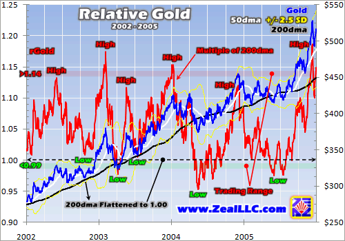
Instead of saying gold at $380 in February 2003 “looks” or “feels” high, why not empirically measure it? If gold’s closing price is divided by its 200dma that day ($324), it yields a multiple of 1.174x (read this as “one-point-one-seven-four times”). I call this Relative gold, or rGold. On that particular day gold happened to close at 1.174x its 200dma, or in other words 17.4% above its 200dma. Subjectivity has vanished!
Now we have a strict mathematically-defined baseline, the 200dma, and an equally objective measure of the distance from that 200dma in the relative multiple (price divided by 200dma). There is no judgment involved here, and the resulting multiple can be easily communicated without its underlying chart. My Relativity construct is a simple, elegant, and effective way to quickly place today’s prices within context in order to make well-informed low/high price judgments with excellent odds for success.
But even with such rigidly-defined relative multiples, the problem remains of where these multiples should be considered low enough to buy or high enough to sell. One more additional layer of context is necessary, and that is the range through which a price’s relative multiple has traded in recent years. This concept led to our famous Zeal Relativity charts, like the gold one below from the same 2002-to-2005 period.
The result of charting relative multiples over time is rather fascinating. It effectively takes the black 200dma line and flattens it into a perfectly horizontal line at 1.00, which is logical since the 200dma is always exactly one times itself. And when the relative multiples over time are plotted on this Relativity chart, the result is a horizontal trading range. In trending markets, relative highs and lows tend to be recurring.
Behold Relative gold, the red series plotted on the left axis. The usual gold technicals are slaved to the right axis. The distance between the red rGold line and 1.00x is the Relativity projection of the distance between the blue gold price and its black 200dma. And with this projection, all percentage distances are identical and perfectly comparable across time. Relativity totally eliminates the visual distortion created by changing baseline price levels.
Gold’s relationship with its 200dma, its most foundational support line over these years, suddenly becomes crystal clear. The gold price has traded within a well-defined percentage range around its 200dma, which the red rGold line traces. After seeing this data, all we need to do is define a relative trading range based on it. Although this selection is admittedly subjective, the impact is minimal since relative ranges are percentage constants. Thus visual distortion doesn’t affect the chosen best-fit relative trading range.
Five years ago when I penned my original essay on Relativity, I chose an rGold trading range running from less than 0.99x to greater than 1.14x. This range should be considered an analog continuum gradually fading from high-probability-for-success times to go long near low multiples on the bottom to high-probability-for-success times to go short near high multiples on the top.
In this rGold example, the closer gold is to 0.99x, or the lower its relative multiple happens to be, the better the chances that a new upleg is imminent. This provides the context warning traders that gold prices are relatively low, an anomalous state that probably won’t last for long within a secular bull market. In order to buy low, traders must hold off on adding new gold positions until rGold trades near or under 0.99x.
Conversely, the closer gold gets to 1.14x, or the higher its relative multiple happens to be, the greater the odds that a correction is imminent. Note in this chart that gold never remains stretched far above its 200dma for long. This too is an anomalous state that cannot persist. In order to sell high, traders should consider exiting positions, or at least putting protective trailing stops on them, when rGold approaches or exceeds 1.14x.
Remember that the absolute price is meaningless. If gold is at $400 but its 200dma is at $300 (1.33x multiple), it is radically more overbought than if gold is at $800 with its 200dma at $750 (1.07x). Prices are only relevant within context, and Relativity excels in providing this context. While a price itself doesn’t matter, the speed with which it got to its current levels is critically important for traders.
Ultimately all this ties into psychology, the sentiment that drives short-term price moves. Prices get ahead of themselves, or overbought, because greed suddenly flares too intensely. Once all the traders interested in buying soon have already bought, only sellers are left so the price soon falls. This unsustainable greed-driven spike manifests itself as a price rapidly surging well above its 200dma, creating the high relative multiple which warns it is time to sell.
And prices get oversold because fear gets overdone from time to time. But once everyone interested in selling soon has sold, only buyers are left so the price recovers. In Relativity terms these conditions are revealed by low relative multiples heralding the time to buy. A price’s ongoing relationship with its 200dma provides all the context necessary to understand whether it is low or high and whether you should buy or sell.
While I used gold in this explanation of Relativity trading, these principles work in all trending markets. Bulls all unfold like this, with the mathematics of the 200dma making a price appear to bounce up along its 200dma over time. Bears work similarly, but their prices appear to bounce lower underneath descending 200dmas over time. So bull relative-multiple ranges are always mostly above 1.00x, while bear ones are always mostly below it.
The primary caveat to Relativity is it is only designed for markets in long-term trends. So it breaks and fails in two key situations that traders must remain wary of. The first is during secular reversals, the transition between bull and bear. While there are plenty of ways to recognize such transitions, realize that Relativity trading won’t work across them. The second is during wild price anomalies like last year’s stock panic, when prices suddenly blow out of trends and break every trading system. Thankfully these are exceedingly rare events.
At Zeal we carefully watch the relative trading ranges of 10 key prices across the stock-market, currency, and commodities realms. In every weekly Zeal Speculator trading alert and monthly Zeal Intelligence newsletter we publish, we outline the current multiples and their recent ranges which are so useful in making trading decisions. In addition, each week we update large high-resolution charts of each relative indicator on our website for our subscribers. This information is incredibly valuable for all traders.
In the new October issue of Zeal Intelligence, we just refreshed our list of relative indicators and discussed why this updated set is so important for commodities-stock investors and speculators today. I also explained how you can use Relativity principles to check individual stocks on your own, to decide whether they are likely good buys or not. All this is in addition to our usual acclaimed market analysis and trades, and this October ZI is free for first-time e-mail-PDF-edition subscribers! Subscribe today and start thriving!
The bottom line is price action is only relevant within context. Traders simply can’t make sound buy/sell decisions unless they can make informed low/high judgments about current price levels. Relativity, by considering 200dmas as evolving price baselines and building an objective measuring system around them, is a phenomenal tool for making these decisions. It should be a key part of every trader’s toolbox.
And due to the very nature of the interaction between any price and its 200dma, these Relativity trading principles are universal. As long as a market is trending, they work anytime anywhere. By simply considering where a price happens to be relative to its 200dma today, and the range of this relationship in recent years, you can radically increase your odds of succeeding in buying low and selling high.
Adam Hamilton, CPA October 16, 2009 Subscribe |
|||||||
|
|
|
|
|
|
|
|
|
|
|
|
|
|
|
|||