|
|
|||||||
|
|
|
|
|
|
|
|
|
|
|
|
|
|
|
|
|
|
|
Golden Gyrations Adam Hamilton November 24, 2000 3944 Words
Noah Webster’s namesake dictionary defines “gyration” as the act of gyrating, circular or spiral motion, revolution, rotation, whirling, etc. The word seems to fit the important market analytical concept of volatility quite well. Volatility is used to measure the price changes that occur in a particular investment over a given period of time. The wilder the price gyrations, the more volatile the investment. Although very important, volatility is difficult to analyze. Raw volatility data graphed looks like a polygraph wired to the Machiavellian mind of a certain popular US politician doing his darnedest to pirate a free election Milosevic style.
In our recent essay entitled Volatility Squared, we took a look at famous equity market crashes and resulting bear markets and analyzed intraday volatility surrounding those events. The results were most interesting. When the obscuring noise of violent daily gyrations in intraday volatility was smoothed out with a moving average, a distinct volatility signature became evident. Every crash was marked with a very large spike in intraday volatility, and every subsequent bear market bottom was marked with a second hefty intraday volatility spike. In effect, these two volatility spikes combined to create an intraday volatility double top signature. Whenever there was a significant crash and subsequent bear market bottom in equities, regardless of the location, size, or era of the index being tracked, the double volatility top left its mark on the charts like the famed Zorro deftly carving his trademark “Z” on any convenient target to commemorate his handiwork.
Rusty machete in hand, we continue to forge ahead and hack through the dense jungle trails of that line of inquiry. In this essay, we will take an initial peek at the gold market from a volatility perspective.
Like volatility, the gold market itself offers unique analytical challenges. As the ultimate currency, and one of a very few forms of wealth that has inherent value and does not represent someone else’s debt, gold has long been metala non grata with socialist governments and their endless fiat currency schemes. As governments swell and bureaucrats build their little fiefdoms, they require an ever-growing stream of money to toss away to the winds to fund whatever the fashionable politically correct mal-investment scheme de jure happens to be. As the ruling and ruled class alike both become addicted to the concept of something for nothing, of a free lunch, the problem of funding these desires grows on a parabolic curve. Sound currencies based on gold are cast aside in favor of paper based fiat currencies. These fiat currencies, of course, have no true value and they only last as long as people have faith in the issuer of the currency. History is littered with examples of sound gold-based currencies being executed by power-hungry politicians and replaced with inherently worthless paper.
Once the journey down the slippery slope of “good faith and credit” paper attempting to replace the ultimate intrinsic wealth of gold begins, the country perpetrating the unnatural act lives on borrowed time. Usually, the fiat currencies last a few decades. In some cases they are held together with gum, duct tape, and bailing wire a little longer, and in some cases they implode in a much shorter timespan. The two threads that seem to influence the life expectancy of fiat currencies are the velocity in which fiat abuses are perpetrated by issuing governments, and the initial level of confidence the general populace had in the ruling class. The faster the Pandora’s Box of paper money creation is abused, the shorter the fiat currency lifespan. The lower the initial confidence in the socialist government, the less time the fiat currency will have to wreak its financial havoc.
The United States, unfortunately for our great nation, has been engaged in a long war against gold. In 1933, Socialist President Franklin Roosevelt pulled a scheme that could have been lifted right out of Lenin’s Black Book of Dirty Communist Tricks and stole the gold of the American people by Executive Order. Since the US was in the midst of the Great Depression, and the general populace had little gold, there were no widespread revolts in response to the brazen attack on private property. Many wealthy holders of gold were forewarned of the impending theft by contacts within the government, and they were able to move their gold offshore and out of the way of the greedy government.
Even with gold declared illegal for US citizens, the war on gold raged on. After 1933, foreign dollar holders still enjoyed the privilege of redeeming their dollars for gold which had been denied to US citizens by Roosevelt. With gold pegged at an artificially low price in the States, gold began to flee the country en masse in the 1960s. The US dollar, once backed by gold, had been inflated by the Federal Reserve at ever-increasing rates and foreign holders of US dollars saw the writing on the wall and demanded gold instead of rapidly depreciating US dollars. The US government, attempting to hide the fiat explosion, engaged in the ill-fated London Gold Pool operation. In the hopes of short-circuiting the free market and maintaining an artificial price ceiling on gold, the US sold gold into the market whenever the supply demand equilibrium price threatened to rise above the officially pegged price. Soon, gold was leaving the US shores in droves to meet foreign dollar redemption demand and to suppress fledgling global gold rallies, and the operation had to be shut down before the US ran out of gold.
In 1971, President Richard Nixon signed another Executive Order that declared the US dollar was no longer redeemable in gold for international holders. The United States of America had technically entered bankruptcy and defaulted on its debt to foreign dollar holders. The dollar became a true fiat currency, backed by nothing but the “good faith and credit” of fallible human bureaucrats. A few years later, in 1974, in an attempt to show the world that gold was dead and demonetized, a “barbaric relic”, the United States government once again declared that US citizens could have the “privilege” of owning gold. The socialist hacks predicted that gold would soon be worth US$5 an ounce and fade into oblivion, as it had no place in the modern world.
Gold, relatively free from its tyrannical shackles, began a massive rally that would culminate in 1980. To the consternation of the one-world pro-fiat pro-socialism and pro-government largesse crowd, gold rapidly rose to unbelievable heights, casting its veto on the new totally fiat US dollar. Since that time, the price of gold has gyrated wildly.
Although the US government apparently lessened the intensity of its war on gold for many of the intervening years since 1980, it has recently become a major priority since 1995. That year, fiat currency began to grow at astounding rates and fueled a mega-stock market bubble. A cornerstone of the equity bubble was the concept that the US dollar could not be perceived as being inflated away into oblivion, or the whole scheme would collapse.
A growing legion of independent investors and analysts are uncovering widespread evidence of a new effort to officially suppress the price of gold. For guilty parties, motives, and the inevitable outcome, please see our earlier Gold Shorts DOOMED essays. Lionheart Bill Murphy and his band of courageous freedom fighters in the Gold Anti-Trust Action Committee have been charging down the guns for a couple years now, carefully documenting exactly who is involved with the new war on gold, why they are doing it, and how they are executing the crime. GATA ( www.gata.org ) has carefully constructed an exquisite record of the events that have transpired in the gold market since 1995, and it is becoming more and more crystal clear what has been perpetrated in the gold market.
The gold markets have NOT been trading as free markets should. Global physical gold demand is vastly greater than global mined gold supply so prices should rise to establish a market clearing equilibrium price. That has not happened. The intersection of market supply and market demand equals price, but not in the manipulated gold market! It is with this gold backdrop that this volatility study is undertaken. We realize that massive official attempts are being made to suppress the price of gold, and that obscures the data making the analysis more difficult. Nevertheless, useful information may be gleaned from making an analytical attempt.
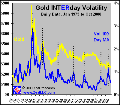
Our first graph outlines the INTERday volatility of gold in the last 26 years. Interday volatility is defined as the closing price of gold on a particular trading day minus the closing price of gold on the previous trading day, and the absolute value of that difference is divided by the close on the previous trading day. As in our Volatility Squared essay, the raw volatility data is distilled into a 100 day moving average to smooth the outlines of the wild and jagged raw volatility data.
Unlike the equity volatility signatures we observed in Volatility Squared, the gold volatility tops do not seem to always coincide with major tops or bottoms in the gold market. Each top is marked with a dotted black line above, and it is important to remember that the 100 day moving average tends to shift the raw volatility data tops slightly to the right. Without the moving average effect, the volatility tops would be positioned a couple millimeters to the left.
The first and second volatility tops appear to coincide with the two great gold spikes in the early 1980s. Gold gyrated wildly, moving both up and down during these initial volatility spikes, and the spikes themselves appear to mark the general whole volatile episode, both up and down, and not necessarily the peaks or troughs exclusively. Three more interday volatility spikes occur from the mid 1980s to mid 1990s, but they do not mark the absolute top or absolute bottom of gold during that period of time. The 1987 spike coincides with the stock market swoon of October 1987, which predictably caused a lot of interest in gold as the ultimate safe haven. The two early 1990s volatility spikes are both near major gold rallies that collapsed shortly after they were launched. The next spike in the late 1990s marks a temporary rally off a major interim gold bottom. The final large spike marks the infamous autumn 1999 rally commemorating the Washington Agreement by European central banks to limit their sales and leasing of gold. Since then, the 100 day moving average of interday volatility has returned to more normal levels.
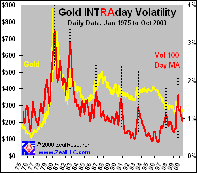
The next graph shows INTRAday volatility. Intraday volatility is defined as a particular trading day’s highest price minus its lowest price, with the difference divided by the previous day’s closing price. Intraday volatility is always higher than or equal to interday volatility. In all markets, the price gyrations within a day are larger than the price gyrations between days. The scales on all axes of this graph are exactly the same as the previous graph to aid comparability. The black lines marking the volatility tops are also in the exact same horizontal positions as in the previous graph.
As we would expect, intraday volatility exceeds interday volatility. The gold price fluctuations within one trading day always exceed (or equal) the gold price fluctuations between trading days.
In order to drill down further into the data, we limited our analysis to the time elapsed since 1985. As is obvious on the above graph, gold behaved rather non-typically from 1975 through the early 1980s. As the US dollar fiat experiment was vetoed by gold and it sought its true value, speculators jumped on the bandwagon and bid gold prices up to unsustainable heights. As the rally began to fail, speculators jumped ship, sell orders for gold greatly exceeded buy orders, and it plummeted. Another goldrush caught hold and gold rallied again, but this second rally also soon failed. Like a car fishtailing on ice, gold gyrated wildly in one direction and then in the other following the destruction of the US gold standard. 1985 was chosen as an arbitrary date to commence further gold volatility studies because it seems to herald the end of the wild gold price gyrations observed since Nixon aborted the gold standard.
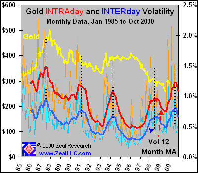
In the next graph, we distilled the daily volatility data into monthly data. We averaged the daily interday and intraday volatility of gold in every month since 1985, and graphed the results. The raw monthly volatility numbers are presented in each of the following graphs as the light lines that are wildly gyrating. The darker bold lines represent 12 month moving averages of the monthly volatility data. As discussed above, the intraday volatility (red) exceeds the interday volatility (blue) on the graph.
The same volatility spikes we observed in the earlier two graphs are marked by black dotted lines. Because the 12 month moving averages encompass a longer period of time than the 100 day moving averages used above, the gold volatility tops are shifted even further to the right of the raw data, about 1 cm. By looking at the light red and light blue oscillating lines underneath the dark volatility moving averages, however, the actual data can be observed. In general, the volatility tops appear to occur most often on steep gold rallies. The shorter the timespan a gold rally is compressed into, the higher the volatility spike (light lines). Of the light red volatility spikes, the seven highest spikes correspond with gold rallies. The mega spike in 1999 proclaims the Washington Agreement, and the spike in 2000 matches the impressive and brief February rally in gold following a major announcement of hedging reductions from a major gold mining company.
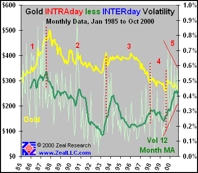
In the next graph, we subtract the interday volatility from the intraday volatility.
This graph is incredibly intriguing. Rather than mark the volatility tops as in the previous graphs, we used red dotted lines to divide this graph into regions for discussion.
In general, when intraday volatility exceeds interday volatility by a larger amount, we would expect general investor and speculator interest in gold to be high. Daily price movements should correspond to some degree to the number of players placing their bets on the gold market. When interest is high, and many speculators, investors, and hedgers are actively involved in the market and all tugging at each other, the gold prices should oscillate quite dramatically. When the gold prices are gyrating around wildly, the volatility WITHIN a single trading day (intraday) should exceed the volatility BETWEEN trading days (interday). In this graph, the light green line is the raw difference between intraday and interday volatility and the dark green line is once again the 12 month moving average. The graph is most interesting and it yields many insights and spawns even more questions.
In region 1, we observe a wildly gyrating volatility difference, a very nice gold rally, and a 12 month moving average of volatility difference that is moving in step with the price of gold. This makes intuitive sense, as one would expect price movements within a single trading day to become more pronounced as gold rallies and more speculators take an active interest in the market. At the end of region 1, the volatility difference tops slightly before the gold rally ran its full course.
In region 2, we once again observe a high positive correlation between the price of gold and the volatility difference. As the price of gold slowly tumbled over many years, the volatility difference also dwindled, possibly reflecting reduced interest in gold in the form of speculator trading to move the daily price around as wildly as in the preceding gold rally. One massive spike in the difference (the light green line right behind the number “2”) marked a gold rally immediately after a gold double bottom was observed, and speculators at the time likely believed gold was heading north again and their bids buffeted the gold price accordingly. Overall, in regions 1 and 2, the volatility difference behaved as we would expect it to in light of the gold price action.
Region 3 begins to get REALLY interesting. In 1993 a very nice gold rally pulled back slightly, and then launched another upside assault. The volatility difference continued to rise as speculators were once again actively pushing the gold price all over the place intraday and they probably believed the rally north would continue for technical reasons. Beginning in 1994, that rally and all subsequent rallies were mysteriously capped. Provocatively, this is the very time that Reg Howe of Golden Sextant ( www.goldensextant.com ) has painstakingly documented that the US Federal Reserve exercised an obscure option and violated prior legal prohibitions by taking two board seats and a direct active role in the so-called central banks’ bank, the secretive Bank of International Settlements. The BIS is based in Basle, Switzerland, and has very large gold reserves. It is currently trying to burn out its private investors so it can become totally central bank owned. Even stranger, it is risking a blizzard of potentially very damaging litigation by proposing to compensate its private investors at a share price well below fair market value and book value. GATA alleges that the BIS is a player in the government led campaign to cap the price of gold.
Following the US Federal Reserve taking a direct role in BIS operations in 1994, the gold market began to behave very erratically. In region 3, from 1994 to 1996, gold traded in a very odd tight sideways range. Every gold rally was capped, but every gold slump was quickly met with heavy physical gold buying and another rally attempt. This period of time is so strange technically that it has only one historical precedent. The last time gold traded for years in this rigid of range was when the US government had an official price ceiling on gold and it was illegal for US citizens to own. We believe another London Gold Pool type operation was launched during this time frame, and once again gold was officially suppressed. The initial line in the sand appeared to be US$400.
In early 1996, gold breached the $400 Maginot line, and the volatility difference began to trend up. Speculators appeared to expect another increase in the price of gold, and the price was buffeted around accordingly. With global physical gold demand exceeding fresh gold mined each year by hundreds of tons, it was a good bet. Inexplicably, however, the gold price dropped like a rock over the next couple years, hitting $300 in late 1997. Gold appeared to ignore the ironclad laws of supply and demand because central banks were dumping their gold hoards on the physical market in increasing quantities in order to keep the price of gold from rising. Alan Greenspan even admitted this very fact in testimony before the United States Congress. If gold rose, it would cast a leviathan-sized shadow of doubt on fiat currency experiments around the world, as well as bleeding precious and scarce capital away from the growing equity bubbles around the world.
In region 4, the volatility difference once again trended in sync with gold prices.
Region 5 begins when the surprise Washington Agreement was signed, and gold leapt up almost $80 in a matter of days. Since then, the price of gold has curiously trended lower as the physical supply and demand deficit worsened dramatically. There was a nice modest rally in February 2000, and a little action near $290 in the early summer, but since then gold has continued to drop. Incredibly, however, the volatility difference has increased massively since late 1999. Intraday prices are fluctuating much more than the small interday price changes would suggest. Speculators and investors appear to be taking a renewed interest in the yellow metal and its price is being thrown around during the trading day. During the time encompassed by Region 5, the price of gold would often rally substantially around the world, and then heavy selling in New York by a predictable cadre of money center banks shorting gold would hammer the gold price back down to a negative or only slightly positive close. The recent intraday volatility of gold continues to grow, while the interday volatility has weakened.
Dr. Harry Clawar has done a fantastic job of empirically documenting what many in the gold community have observed in Region 5, especially in 2000. In a great series of essays published on the outstanding Gold-Eagle website ( www.gold-eagle.com ), Dr. Clawar points out the statistical absurdity of gold trading higher around the world almost every single day and then being relentlessly hammered down in New York. This peculiar pattern happens over and over and over again. Bill Murphy of GATA has repeatedly pointed out that free markets just do NOT trade in the exact same rigid pattern and direction day after day and week after week, especially in our chaotic world where nonlinear exogenous events occur each day (USS Cole, Israel, election piracy, US equity market weakness, etc) that constantly alter gold investment demand. In light of Dr. Clawar’s and Mr. Murphy’s research and observations, this graph further buttresses the mounting evidence of official sector gold price manipulation behind the scenes.
Finally, in Region 5 we notice a strange shrinking wedge pattern occurring in the volatility difference raw data (light green line). The volatility difference is oscillating violently but the tops and bottoms are forming a distinct wedge, which is bounded by light red lines. What the heck does this mean? We sure don’t know, but it is certainly intriguing!
One final graph is offered, which presents the ratio produced when intraday volatility is divided by interday volatility. The vertical scale on this graph is expanded so the price movements of gold are easier to follow. Once again, the raw volatility ratio data is represented by the light blue wildly gyrating lines and the 12 month moving average is shown with the bold sky blue line.
When the ratio is high, intraday volatility is relatively higher than interday volatility. When the ratio is low, intraday volatility is relatively lower compared to interday volatility. Provocatively, another apparent anomaly is observed in this graph!
In region 1, the volatility ratio increases as the gold price rises. In region 2, for reasons unknown, the ratio diverged and had a negative correlation with the gold price. Interestingly, this divergence was marked by a major change in the general direction of the gold price. It was also the last time we have seen $500 gold (shortly after the 1987 stock market debacle). In region 3, the volatility ratio tracked the gold price very closely, with an almost perfect correlation.
In region 4, however, there is a new sharp divergence between the gold price and the volatility ratio. The last time this occurred, in region 2, it marked a major change in the direction of the gold price. Is this neo-divergence heralding a gold bottom and an imminent major change in the gold price in region 4? Is the gold mega-bull beginning to awaken from its slumber?
We are unable to divine the answers to these important questions. We humbly submit our volatility research and interpretation of the data to the wider gold community. We hope our initial murky look at gold volatility is rendered clearer as great minds around the world cull over the data and tentative conclusions and offer up improved hypotheses to explain the observed data.
As the legendary King Solomon wisely pointed out, “As iron sharpens iron, so does one man sharpen another.”
Meanwhile, the golden gyrations continue…
Adam Hamilton, CPA November 24, 2000 |
|||||||
|
|
|
|
|
|
|
|
|
|
|
|
|
|
|
|||